Most of these reviews are from the Charleston City Paper, where I was a critic and contributing arts editor for several years, writing over a million words about theatre, film, visual art, and other cultural fun and games.
- Young Contemporaries 2007
- Hesitant Muse at Ann Long
- The Young and the Zestless
- Mary Edna Fraser: Water For Life
- Suitcase Show
- Mary Jane Jacob
- Unlikely Target at Redux
- Stormin’ Matthew Foreman
- Openings by McLean Stith
- Paper Monument
- McLean Stith Lifts the Veil
- James Innes, Kristi Ryba, and Daphne vom Baur
- Flight Club
- Charleston Art Walk 2007
- When Nature Calls
- Gibbes Timeline
- Best Local Visual Artist
- Best Art Gallery
- Best Post-Modern Art Show
- Larry Louie
- Transit Antenna: The Long Haul
- Gideon Bok
- Big Works
- Avondale Art
- Black vs. White
- Culture Shock
- Manning Williams
- Rik Freeman
- James McNeill Whistler at the Gibbes
- Brian Bustos
- (Re)Orientation
- New Structures
- 1 x 1
- Patrick Pelletier
- Intended Consequences
- Leslie Wayne
- Ernest Hemingway and Walker Evans
- Cellblock Visions
- Simon Norfolk
- Mary Walker
- Column: Art is Hard
- 2006 Year in Review
- 2005 Year in Review
- Alison Piepmeier
- The Future is Here
- Flower Power
VISUAL ARTS Bright Young Things
by Nick Smith April 11, 2007

Young Contemporaries 2007
On view through April 27, 2007
Halsey Institute of Contemporary Art
It’s always disappointing for me to walk into a gallery and see a dull, uninspired show. Last Easter it happened at the Halsey, where its Young Contemporaries exhibition seemed largely bereft of bright ideas or confident technique. Each year YC highlights the best work from the CofC Studio Art Department, with a cross-section of different media selected by an independent juror and curated as a professional-level group show; that ups the stakes for the contributors, who usually rise to meet the challenge of providing high-grade work. But the quality level dipped in 2006.
When I expressed my disappointment in the City Paper, some readers accused me of being “cruel,” “mean,” and (worst of all) “uncool” for criticizing student work. As artists-in-training, the argument went, they weren’t ready for their work to be held up to the cold light of criticism. Better to encourage them with positive remarks or say nothing at all.
I don’t think anyone benefits from sweet talk, so I’m pleased to say that this year’s Young Contemporaries contains several artworks that actually deserve praise. It’s effused with the imagination and attention to detail that was lacking in 2006. This is the largest YC ever in terms of the number of artworks — 135 pieces in total, compared with 100 last year — but there’s no clutter and a minimum of junk. Each piece has room to breathe and be appreciated in its own right. Kudos to juror David Cohen, a New York curator and art critic who selected the work and had sole say on the show’s layout.
The paintings are a mixture of clean, respectable realism and rash experimentation. Danielle Brutto’s acrylic “Sleep,” with its subject lying in bed, successfully suggests the feeling of being enveloped in slumber. “Greek Life” (Joel Parker, oil on panel) places a group of playful young men and women in modern (if skimpy) attire amidst classical ruins; a subtle choice of colors helps the ancient and the modern to mix.
Fontini Christophillis’ more abstract “There’s No Stopping Curiosity” is full of energy, showing a literal explosion of colors and brushstrokes. A small, primal figure withstands the force of all the layers and strands of paint. Jody Christian’s oil on panel “Personal Perspective” is a self portrait with an appealing color scheme (orange, pink, and yellow) — especially when it’s compared to its grotty neighbors. Placing Christian’s painting next to the dark and messy “Black #4” (Michael Austin Diaz, latex enamel) and “Untitled” (Susan Reed, oil) is like parking a coiffed poodle next to two pit bulls.
Diaz’s photography is a lot stronger than his latex experiment. “Cottageville,” a sepia-toned shot of a dilapidated variety store, has a Walker Evans atmosphere without seeming derivative. Other photos benefit from assured perspective, like Jamie L. Kirby’s “What Holds Us In” and Emrys Jaskwhich’s “Untitled,” which incorporates a posed subject and graffiti on a wall (reading “More Money More Problems”). Caroline Wooten’s portrait of “Pippy,” a man with pigtails, is full of life and character. And Dan Gamble takes a fresh look at everyday objects with details of popcorn and a Slinky toy.
This show proves that an idea can be almost as important to the success of an artwork as technical ability. When the two are combined, we get a memorable exhibit. Even a tried and trusted artist’s exercise can be given a new twist, as in Lauren Faust’s “Untitled.” Faust’s monotypes of facial features depicted from different angles are deliberately oversized and displayed to striking effect. Elizabeth McWilliam’s pastel on paper “Dictators of Oz” is another good idea, with characters from The Wizard of Oz recast with real-life tyrants in the lead roles.
The atmosphere of experimentation extends to the materials used in the show. There’s video and computer-animated art from Andrew Dyck; a plasticky “Church and Oak Tree” by Rebecca Loren, where the medium could be a comment on organized religion; “Insecure,” Abbey Biddle’s oil-and-wood nude mosaic complete with round wooden nipples; and a handmade book by Jessica Jones, “Constant Proximity: Adoration/Abhorrence,” which documents the pain and joy of close friendship in intimate, emotive detail.
On the other side of the Simons Center, the exhibition’s Salon des Refuses — a tip of the hat to the 1860s-born show for rejects from the Salon de Paris — also has notable mixed-media work. Jody Christian’s “$630 Pancreas” is made up of cigarette butts and hardware cloth, while Ashley Bransome’s “Zen and the Art of Dying” is a miniature bone garden. Their odor adds an extra dimension to both pieces. The quality of the sculpture here is a vast improvement on last year’s; Karleigh Hambrick’s “Sun Sculpture” is the only one that really doesn’t work thanks to its overabundance of colors and gold sparkles. Like the sun, it’s not something you can look at for too long before your eyes start hurting.
Even when an artist’s talents have yet to be honed, her imaginative enthusiasm can raise the level of a show and make it a must-see. Thanks to that zest, Young Contemporaries 2007 won’t jar overmuch with the national-standard exhibitions that the Halsey usually hosts. If nothing else, the latest batch of CofC students has seized the chance to be scrutinized in the same light as the artists that they hope to one day work alongside.
Ann Long’s artists pay homage to the fairer sex
by Nick Smith April 14, 2010

Since the dawn of civilization, art lovers have been drawn to entrancing women. Venus de Milo. Aphrodite. La Gioconda. Michelle “Bombshell” McGee. (Scratch that last one.) No matter how sophisticated we become, we never tire of looking at them. Knowing this, gallery owner Ann Long showed her artists some of the most popular portraits from previous shows. These inspired the classically trained painters to create brand new works, and the result is Woman, which Long describes as “one of the prettiest shows we’ve ever done.” While there are no bombshells, the exhibition is full of exquisite portraits, subtle references to Old Masters, and coded imagery.
Paula Rubino’s “Trilby and Svengali” dominates the show. At 58″ x 45″, it’s the largest oil painting. It also stands out because of the loose, organic brushstrokes that Rubino uses. The work’s two red-skirted women look as if they’ve been interrupted mid-conversation and are miffed about it. They both bear more than a passing resemblance to the artist, showing two sides of her personality — quizzical and world weary.
Next to the double self portrait is the more traditional “Winter Profile” by Louise Fenne. This side-on look at a pale-skinned young woman demonstrates Fenne’s delicate, precise style. Lotta Blokker contributes a bronze bust called “Woman.” The face and hair are full of alluring detail, but her expression is snooty, giving her a simultaneously touchable and untouchable air.
Symbols abound in Kamille Corry’s piece “Hesitant Muse.” A young woman sits with her hand around a small glass bottle, eyes closed, a contemplative expression on her face. She wears feathers in her hair to symbolize her potential strengths. In the background are moths (desire and mortality) and skeletal branches (the death of a season). The muse’s green and yellow dress, along with her bottle, hint at a venerable history of paintings featuring Mary Magdalene with an alabaster jar.
Different examples of beauty include Fenne’s mystical “Elf,” who has wings and large brown eyes, and “Tine in Winter,” showing a more mature, less innocent face. With paintings like these, Long encourages us to look beyond our usual perceptions of beauty. Beneath the smooth-skinned façade, we find emotional pain leading to a renewed sense of self.
On view through late April. Ann Long Fine Art. 54 Broad St. (843) 577-0447.
VISUAL ARTS The Young and the Zestless
by Nick Smith April 5, 2006

Young Contemporaries
On view through April 28, 2006
Halsey Institute of Contemporary Art
At the end of every academic year, the Halsey Institute rolls out Young Contemporaries — an exhibition of work by current College of Charleston Studio Art students. An independent juror selects the pieces for display and, like it or not, his choices represent the department’s annual output. This is the public’s big chance to see what’s been going on in the paint-spattered studios of the Simons Center in what’s described by Dean Valerie Morris as a showcase of “our most talented student artists.”
Whether it’s due to a dearth of maturity or inspiration, this year’s show mostly lacks the quality of its predecessors in a way that’s summed up by a scarcity of titles. While it’s good to let the art speak for itself, there are a hell of a lot of unidentified objects here, and no matter what anyone thinks, “Untitled” is not an imaginative label for any piece.
That seeming lack of imagination is, unfortunately, reflected in much (though not all) of the art on display as well. There’s technically proficient work and some fresh ideas at the Halsey, but several misfires as well, with the sculptors leading the below-par pack.
An untitled sculpture by Robin Willoughby combines sections of tree branches and chair legs in a way that would be intriguing if it weren’t so busy. Jessica Jones’ “Untitled (Cocoon)” has a puddle of resin beneath an eerie fiberglass chrysalis, and viewers are left to wonder what could have burst from the cocoon, but instead of fully utilizing negative space, Jones lessens the effect with a multitude of welded steel plant stems. The result suggests a lack of confidence in the art’s power to tell a story without a load of bits and bobs added.
Chris Itteilag’s steel and glass “Akutaru No Sei (Evil Keg Spirit)” is more successful, with a Jack O’Lantern face carved in a beer keg. A samurai sword has curbed its wicked ways, but flames still flicker from its head. Unfortunately, Itteilag doesn’t know when to stop, either, and spoils the primal effect by adding another, connected mask.
Right next to Jones’ fiberglass cocoon is the more efficient “Angular” by Ryan Klimstra, with a biomechanical blend of curved and pointed shapes. Other sculptures in the show make good use of unusual materials; Liza Twery’s untitled life-size figure has a steel skeleton and plastic skin (at last, a good use for discarded grocery bags). Judy Christian’s “French Horn” mixes tie wire, brass, panty hose, and spray paint to suggest the instrument’s delicate innards.
The show’s sketches and paintings have got the techniques down, too, but few of them have more to offer. There’s an entirely orthodox range of figure studies and some colorful portraits. Beth Wootten’s vibrant “VCR” (oil on canvas) is split in half horizontally, showing the faces of two lads on each tier. The size of the canvas and use of colors are the painting’s best assets.
Blythe Brown’s “Candlelight” (oil on masonite) stands out for a very different reason: its use of a simple chiaroscuro effect with a feminine subject on a brown background. Vadim Smirnov’s unnamed painting is far more complex, but this time the intricacy’s a blessing. Smirnov uses bleach and acrylic on textile to evoke medieval stained glass and an oriental ambience with a nude figure. It’s a rare instance in this show of a clever idea successfully carried through.
This year’s strongest medium is photography, with confident work and an experimental edge. Blair Lamar’s miniature ‘lifts’ in “To Chase a Bunny” give Beatrix Potter scenes a movie storyboard slant. Ashley Heizer’s untitled black-and-white shots include a reflection of the photographer’s hand in the foreground, blending the artist with the art. Laura Elara Black’s “Alex in Wonderland” and Eliot Dudik’s “One Last Grasp” are more functional, but still full of character.
In reality, this year’s show is as much a reflection of juror Gideon Bok’s tastes as the output of the Studio Art department. Bok selected a whopping 100 pieces, and there’s more in an adjacent Salon des Refuses, showing work that didn’t quite make the cut. It’s commendable that so many students get their chance to show work in a professional gallery context. All the same, as with some of the sculptures in this show, it might not have hurt to have kept in mind the maxim “less is more.”
VISUAL ARTS Weird Science
by Nick Smith April 4, 2007

I was always more of a word nerd than a science geek at school. Despite frequent assertions by our teacher that “physics is fun,” I found it hard to get excited about the old textbooks he used. They had grainy black-and-white illustrations of lab scientists with ’50s-style black rimmed glasses and ridiculous haircuts. It was as if some kid-hating publisher had a secret plot to bore children to death by flooding classrooms with dry and dated schoolbooks.
In his solo show at Redux Contemporary Art Center, bio-artist Kevin Jones has taken similar dour illustrations, blown them up, and juxtaposed them with star charts and pop-art-colorful images from nature, all mounted on aluminum. He takes the serious, documentary-style textbook photos and compares them with the almost magical, seemingly infinite mysteries of the universe.
Sharing space with functioning technological installations, the photos and accompanying diagrams reflect our human desire to define and catalog those mysteries, grounding nature’s wonders in reality.
My favorite installations are “Vastness of the Universe,” a sensor on a stand that scans for local weather reports; “Regelation Microcontroller,” which shows an animated ice cube on an LCD monitor that melts and refreezes depending on your proximity to its sensor; and “Devices to Supply,” with a calculator embedded in a Space Technology book. The calculator is powered by 20 moldy lemons arranged in delicate, wiry rows. All three installations are low-tech enough to reveal their innards while retaining the sense of wonder that technology can evoke.
Source Coding, on view through April 21, captures the impact of science and biotechnology while linking it to those dumb school books. My science teacher would be proud of Jones. Redux will show more of this kind of stuff in the fall, when the center starts a new lecture series exploring technology and art. Solid backup will be provided by the CofC’s computer science and history departments.
Mary Edna Fraser blurs the boundaries between art and science in a very different way. For her new exhibition at the City Gallery at Waterfront Park, she’s referred to geologist Dr. Orrin Pilkey’s work on global warming and the way it’s made sea levels rise. Since Fraser likes to create water-wrapped land masses with dye on silk, this is right up her street.
While her large-scale pieces (“Monterey Canyon” is 10 x 6 feet) benefit from the gallery’s light and space, there are smaller monotypes on paper as well. The complex “Wind” is a more manageable 34 x 18 inches. But it’s the batik work in bright red, orange, and blue that makes jaws drop and eyes pop. They’re wildly original, remarkably detailed, and illustrate the watery erosion of great land masses.
Fraser’s Water for Life art shares gallery space with photographs provided by Charleston-based Water Missions International. There’s also a low-maintenance Living Treatment System on display, the kind supplied to people in developing countries with unsafe or hard-to-reach water. The ungainly treatment system contrasts Fraser’s soaring aerial landscapes and WMI’s down-to-earth challenges. The color photos, mostly depicting the beneficiaries of the clean water program, look out of place beside the graceful silk art. It would have been better to keep the photographs upstairs and the batik downstairs rather than placing them next to each other on both floors.
Kevin LePrince’s “Water for Life” is a better fit. It’s an oil painting inspired by a photo of a Ugandan girl carrying water on her head, detailing the intense heat around her and the sweat trickling down the back of her neck. Although its role in the show is not explained, it’s the first thing visitors will see when they step in the door, helping to bridge the traditional (the informative photographs) and the invigorating (Fraser’s textiles).
Aesthetics aside, the photographic exhibits, on view through April 15, acknowledge the global problem of contaminated or inadequate water supplies. The problem affects more than a billion people, and a child dies every 15 seconds from an associated illness. WMI aren’t just documenting the issue, they’re tackling it, too. Go see Fraser’s work to see some fine art, and the photos for a wake-up call.
Phillip Hyman hosts an off-the-wall art show in Park Circle
by Nick Smith March 31, 2010

You couldn’t put clothes in them. They were cumbersome to carry around. Some of them were filled with bugs or strange brassieres. So what use were the suitcases in last week’s Suitcase Show?
The answer is there wasn’t any, and that’s how curator Phillip Hyman likes it.
A lot of things have changed in Charleston’s art scene since Hyman hosted the first Suitcase Art Show at Cumberland’s four years ago. The music venue/bar on King Street was right next door to vintage clothing store Granny’s Goodies, which donated 30 old suitcases for the 2006 exhibition.
Artists transformed the cases into unique fold-out paintings, dioramas, shrines, and sculptures. Some focused on decorating the outside of the case, while others crammed colorful baubles inside. Participants included Hyman, Jonathan Nicholson, Eleazar Cruz, and Phillip Estes. Geoff Cormier contributed one with a shadow puppet. On opening night, live music was provided by local musical acts Lindsay Holler, A Decent Animal, and Sleepyhead.
By late 2007, Granny’s Goodies was gone and Cumberland’s was closing its doors. An Apple store now sits in its place. Corporate uniformity has taken the place of rock and punk bands, mystery beers, and heavy metal karaoke.
In March of this year, Hyman revived the Suitcase Show for one night only at the Olde North Charleston Meeting Place on East Montague Avenue. Hyman, who curated a TV-themed exhibition at the same site last year, wanted to let people know about the cases like “a traveling salesman,” circumventing the traditional art show invitational approach — meaning no advertising, no call for entries, not even a Facebook post. “A lot of artists you usually see in the paper lately didn’t respond,” he says. “Instead we got the ones that are hungry and doing it for art’s sake.” People didn’t come just to drink and pose — they came for the art and music courtesy of Subterranean Bleu Mind(s), founded by hip hop/groove duo DizZyDeTaiLs and Halfblind, who back their act with projected light patterns.
Three weeks before the show, Hyman picked up a CD of Bleu music that would inspire a stack of live art. “A major part of the concept for me was to showcase the music by painting to it, and have people looking at it as part of the art show, putting it in a different realm,” he says.
Live painting to music has been popular at recent events like Blume and Kulture Klash, but in those shows Hyman points out that the artists “aren’t really trying to tell a story.” At the new Suitcase Show, the music was presented as an artform accompanied by the paintings, and the audience went with the flow. “The crowd followed us around without anyone telling them what was going on,” says the curator. “I’ve never seen that before.”
The artist and audience demographic spanned 9-year-old schoolchildren to first-time adult artists to old hands. Some came wearing gray pants and Dockside shirts, others with torn jeans and pierced faces. The suitcase art was just as diverse, with contributions from Geoff Cormier, Leigh Wells, and many others. Most impressive was Hyman’s steampunk case, lit from within with delicate cogs and wheels like the baggage of his ever-inventive mind.
Hyman isn’t the only indie curator in town, but more than anyone else, he inspires artists to make art for the sheer pleasure of making it instead of moping around worrying about buying materials, advertising budgets, gallery showings, or exhibiting to the “right people.” For the rest of us, he offers a reminder that art doesn’t even have to have a physical substance — it can consist of sound or light — and it certainly doesn’t have to be framed or hung on a wall to move its viewers. It can be constructed out of donations from a vintage clothing store, an old TV set, or even packed up in a suitcase.
Celebrated curator returns to jury CofC exhibition
by Nick Smith March 31, 2010

Mary Jane Jacob arrives at the airport from Chicago around noon. She’s in town for a weekend to jury the CofC School of the Art’s Young Contemporaries exhibition. She’ll grab some lunch, unpack her bag, then dig in to her task. But first she has a stop to make.
#
“I have a thing at two,” says Jacob, a professor and executive director of exhibitions at the Art Institute of Chicago. “It’s at the Borough Houses.”
Jacob is driven to the Ansonborough neighborhood, where two small, quaint white houses stand resolute near taller modern structures like the main county library and the Gaillard Auditorium.
The main house on Calhoun Street was built in the 1850s by Irish immigrants. Many people pass by the houses; some even read the new historical sign — Jacob is attending the dedication. But few know or remember the part these houses played in Evoking History, a Spoleto art event. In 2002 the house became a community meeting place filled with references to the family histories of past residents. Live and taped oral accounts gave a sense of the importance of the neighborhood to local culture and the people who lived there.
Now Jacob is coming back, her black hair cut no-nonsense short, wrapped in a white jacket slightly crumpled from her flight. Unlike most independent curators, who will work on a project then move on to the next one without so much as a fair-thee-well, she has kept in touch with the Borough owners and has taken an interest in its upkeep. The stop-off is no mere publicity task; she’s genuinely concerned with the fate of the houses and the people connected with them.
The three-year-long Evoking History was just the kind of art project/community outreach program that Jacob excels at. Beyond the houses, there were art installations, a Youth Fellows Program, sculptures, and writing projects. Eleven years previously, Jacob curated Places with a Past, also for Spoleto. That show, which used local sites in Charleston as backdrops for art examining the city’s history, was so costly, conceptual, and non-traditional that the festival’s founder and artistic director Gian Carlo Menotti threatened to resign over it. (Other circumstances led to his ultimatum, such as friction between Menotti and General Manager Nigel Redden. At the same board meeting, Menotti withdrew his threat.)
The group of 17 critically acclaimed installations is still talked about to this day, and its remnants can still be seen downtown. On the southeast corner of America and Reid in the Eastside of the peninsula is “House of the Future” by David Hammons, a sculpture in the form of a skinny little house. This and the more recent “America Street,” a park on the northwest corner were “pivotal,” says Jacob. “Built with the community, it was a very pregnant signal for what we all hoped this art would do and can do — speak about issues, transcend them, and sometimes unite people into a common dialogue.”
Presumably, Jacob will look for a sense of place and identity when she serves as guest juror for Young Contemporaries. She knows how important progress and dialogue is to the students submitting work. She hopes that they will share their sense of history gained through living in Charleston and “the things they see that are very nearby.”
This is a benchmark year for the show, open to all current art students. It’s the School of the Arts’ 20th anniversary and the first student showcase in the pristine new Cato Building. This is a big chance for the entrants to have their work seen and purchased in a well-respected gallery setting.
It’s also an opportunity for them to catch the attention of Jacob, who admires the artists and other folk who take the initiative in what she regards as an “energized and still connected community.” She also notes of the entries, “Some work was of [Charleston]: its landscape and people. But in looking at about 500 works, many were also of human subjects that transcend place and time, while others were individual expressions — and all of these kinds were in the show.”
Although we doubt whether her selections will have even a whiff of the controversy of Places with a Past, we look forward to some extraordinary choices from this high-profile fan of Charleston and its culture.
VISUAL ARTS Moving Targets
by Nick Smith March 29, 2006

The Unlikely Target
On view through April 13
Redux Contemporary Art Center136 St. Philip St. 722-0697
Visual artists face many hardships — the threat of annoyingly persistent creditors, ridicule from their peers, etc. But worst of all is the potential for self-absorption: the danger that their regular immersion in the subjective world of personal expression means they’ll get so involved in their work that they’ll disappear up their own rectums.
What better way to avoid this than a national call for entries for a juried painting exhibition? That way, local artists aren’t working in a vacuum; they’re competing for attention with applicants from different backgrounds who experiment with different ideas, and provide potential inspiration for the residents who see their work.
The Unlikely Target, at Redux, is a correspondingly creative trove of efficiently produced art, using all kinds of materials and, in some cases, a whole bunch of colors too. The 20 carefully hung pieces complement each other as individual statements that work together in a contemporary theme — the quest for innovation.
The show was juried by impartial out-of-towner Brad Thomas, director and curator of the Van Every/Smith Galleries at Davidson College, N.C. Thomas has recently overseen exhibitions of narrative paintings, sculptures, and animated films at Davidson, but here the emphasis is on abstract painted work.
That doesn’t mean there isn’t a great variety of different styles and concepts on display. John Wilson’s “Headlights” shows two monkeys suspended from a deer’s antlers, clinging to its flanks. The animals all sport grins and are painted in bright acrylics on a large canvas. With the deer’s saucer-like eyes and the curved bodies of the monkeys, Wilson achieves a strange meld of animal and bus.
Close by, Maria Britton’s “Dear Suspended” couldn’t be more different. An adult holds a child in a drab, sickly-hued scene. The acrylic on bedsheet is flat, with no dimensions to it. And right near that is a German entry, a Bauhaus-flavored circle of colored shapes called “Adhesion Fash.” With the dark blues and light purples at his disposal, Berlin-based Ryan Scheidt creates a sense of strong layers with gouache on paper.
The local entrants acquit themselves well. Seth Gadsden’s tranquil oil on wood panel “Moon” mixes fancy with photorealism, with a deep black sky and gray, sunlit areas. Referencing black-and-white video images and astronauts’ memories of the lunar landings, it looks solid enough to make you want to reach out and pick up a chunk of moon rock.
Karin Olah continues her fascination with abstract patterns and rich colors. As “A Discourse” drips downwards, its fabric scraps resemble a melting sofa that would get Dali’s moustache twitching. Olah includes gouache and graphite to increase the oozing effect in an artwork that’s freer than her abstracts on display at Corrigan Galleries; Townsend Davidson’s “The Big Rig” is more complex than usual but plays with the same seascape motif as his earlier paintings. In this instance, the juxtaposition of an oil derrick and a red buoy with a lone, landlocked toilet remind us not to take his months-long work too seriously.
Redux aimed to promote innovation with The Unlikely Target, and that’s evident in the artists’ use of materials. They prove that in the right hands, almost anything can be a canvas — a shower curtain (Marcelo Novo’s spray-painted bleeding heart plumbing on “Curtain #1”); bubble wrap (Keith Linton’s underwater tendrils on a honeycomb background in “Momentum”); fabric and pine (Michael Wyshock’s “Utensils,” with forks and spoons bundled up with cloth and fabriano paper, the closest this show gets to sculpture).
The abstract shapes and unusual materials help make the show appealing and eclectic, yet it’s the least innovative work that’s the most accomplished. The best example of this is also one of the simplest submissions — Josh Doub’s oil on canvas rockpiles, where the merest smudges of color give the impression of people and objects. In his small, unassuming way, Doub takes everyday elements of nature and makes them his own in a statement that’s as individual as they come.
Matthew Foreman storms Spark Studios
by Nick Smith March 24, 2010

When Matthew Paul Foreman finished his jail sentence for defacing public property in early 2009, he could have quit street art altogether. Instead he found another use for his wall-scrawling skills, taking his spray-painted art indoors and making a name for himself on the local market. Barely a week went by without “Stormin’ Foreman” entering one show or printing art for another. He was soon getting serious attention from Eye Level Art and Vaughan Christopher Gallery in Texas.
“When I came out of jail, I had to look at myself and be objective,” says the 25-year-old Atlanta native. “I took my street art passion to a new level, where I could still experience the thrill of making art but make it safer, more lucrative, and more fun.”
Redux provided a big boost for Foreman when it facilitated a group collaboration with famed graffiti artists Dalek and Chip 7. Here were artists who straddled the street and the fine art world, confirming that Foreman could be commercially viable without fettering his brash, psychedelic style.
“I’m really into portraits,” he says, “and using wild colors. They’re not too dark. I like stuff to be bright.” Foreman brightened up 25 different group shows in 2009, including Kulture Klash, Blume and reBlume at Pantheon, and Eye Level’s Portrait Slam and The Debutantes. He also contributed work to multimedia events like Skinful Halloween. Obviously, there is demand to encourage this supply. “My art appeals to almost everyone I meet, all different types of people,” he says with genuine surprise. “Anyone I interact with likes it and is interested in buying it. It’s a blessing.”
Foreman links this with his passion for graffiti, which is constantly in the public eye, reaching passers-by and embellishing their environment whether they like it or not. It certainly gets a strong reaction from those who see it.
Another ingredient of Foreman’s success is his versatility. Although he’s best known for layered spray-painted images with handcut stencils, the artist also uses collage, digital art, poster art, and hand painting.
After so many events last year culminating in the Upper Deck charity show Golden Opportunity, Foreman was ready for a break. He didn’t get one. He was contacted by Daniel McSweeney of Spark Studios, who said he was interested in hosting Foreman as a featured artist. By spring he’d put together two solo shows, EquipoisE at Muddy Waters and the current Stormin’ Foreman at Spark.
Although the artist has sold a considerable amount of his work, there are still many familiar images in the Spark show. A wild-eyed Christopher Walken and local heroes John Pundt, Clay Scales, Julio Cotto, and Ankit Sheorain have all been given a Warholesque monocolored tint in Foreman’s prints, along with influences like his parents, friends, and Warhol himself (in drag). Images of astronauts and wrestlers give the exhibition a more universal appeal.
With its trippy purple, yellow, and blue colors, mirrored images, and seemingly unconnected portraits, a walk through Spark is more like a visit to a funhouse than a fine art exhibition. But there are also signs that Foreman has serious aspirations, with some framed art and a theme for the show, whether it’s intended or not. Recurring pictures of birds by Foreman and Cyr develop a motif of flight and freedom. After participating in more than two dozen group shows, Foreman’s earned the right to be respected as a local artist. Who knows, he might set a good example for the next generation as he tries to be good.
VISUAL ARTS Pretty in Pink
by Nick Smith March 22, 2006

Openings
On view through April 7
City Gallery at the Dock Street Theatre
133 Church St.
724-7305
I’ll come right to it: There’s considerable risk in filling a very small room with paintings of flowers heavy on the color pink and calling the exhibit Openings. Flowering plants have intrigued artists throughout time, from Van Gogh, with his über-famous “Sunflowers,” to New Mexico modernist Georgia O’Keeffe and current Gibbes fave Margaret Mee. There’s just something about the delicacy of flowers that calls out to certain artists, challenging them to depict the soft petals and all the complex aspects that make the tiniest flower look like nature in a nutshell. But these very same features give many flower paintings an unmistakable yonic quality. Fortunately, local artist McLean Stith’s new show at the City Gallery at the Dock Street Theatre is no gynecological peepshow; her 12 robust flower studies are more thorny than horny. In fact, the result is a more colorful, positive show than most that we see there.
Stith’s oil paintings are usually large-scale, with a tendency toward landscapes and landmarks, all with an edgy, contemporary touch. Last year, her work cropped up at Piccolo’s In the Spirit at the Circular Congregational Church, and at December’s The Chase Is On show on King Street. This is something different. For her solo exhibition, she’s narrowed her focus to 12 mixed-media pieces, all featuring flowers.
Stith has used the City Gallery show as an opportunity to try all kinds of different techniques — spray bottles, spills, delicate brushstrokes countered by sharp grooves — that bring new elements to the vintage subject matter, and prove that Stith is comfortable with various artistic methods. “Iris” includes tight, circular strokes that give the flowers great energy, as if they’re growing and nothing can stop them. The vase can’t contain them and the canvas barely manages to do the same. The simple forms of the petals are like fingers reaching up into a pale blue spring sky in a celebration of life — quite a feat when short-lived cut flowers are often considered a symbol of mortality.
By contrast, Stith gives her “Daisies” thin, spidery petals that aren’t fully rendered. In “Orchids and Eucalyptus I” she uses squiggly crimson lines to suggest the flowers, their bright color contrasting with the ethereal edges.
The most successful pieces make strong use of pink, purple, and aquamarine colors. The blue background of “Daffodils and Asparagus Fern” catches the light, giving a shimmering aura to the daffs that seem to be crooning and swaying along to their song. Livid “Peonies” also seem full of fun, painted with wine-red swirls that are looser than those of “Iris.”
“Pink seemed to keep turning up in this exhibit,” says Stith. “I couldn’t stop with the pink. The pieces cried out for more. Usually I try to limit pink to avoid being marginalized as a ‘female painter,’ but this recent bout with pink was intense and necessary.” Blasts of color continually brighten the series, with the exception of “Roses in Gold Vase,” which has a more subdued, Victorian feel.
To find her colors and canvasses, Stith looked in some unusual places, using materials as varied as the techniques, including house paints on door panels. “I like to get house paint from the Habitat for Humanity store,” says the artist, “because their refuse paint comes in such weird colors. I can spend an hour prying the lids off the old rusty cans to look for a color that strikes me. The colors I find there I may mix in with art store acrylics or use straight. They can have a drastic impact on my palette, depending on who has cleaned out their garage — I like the randomness of this.”
That random element is important to Stith, who marries her psychological and emotional side with her reasoned, academic one. The key link between her career as a dermatologist and her art must be her curiosity, a trait that’s led to an intriguing body of work.
Her two lives coincide in “Daffodils and Squames,” with soft-textured, bright yellow flowers on a muted aqua blue background made up of Mondrianesque squares. “Squames are a nickname that dermatopathologists use for squamous cells,” says Stith, “which are the cells of the epidermis which are square-ish in shape. I look at them under the microscope a lot, and this was likely the influence.”
The show’s overall effect is one of a room in bloom, although the subjects are painted in their various stages of growth — “Thorny Roses” includes closed, wide-open, and wilting flowers, with thorns that blend into the green-tinged background if viewed up close, but stand out at a distance. Conversely, “Gerbera Daisies and Spray Roses” has a daring gold background. As with “Roses in Gold Vase,” the color never seems garish or overused and it doesn’t eat up the daisies.
In her unique and curious way, Stith uses her didactic perspective to inform her process of, in her words, “loosening up and playing around with different techniques.” Her exuberant work provides a different view of life, capturing the free expression of nature.
Brooklyn-based arts journal presents a paper-thin exhibit
by Nick Smith March 22, 2010

So much of our existence is paper thin. We tell ourselves that we are content with our lot, that we can control who we love and who we live with, that everything will be all right. But tear that paper veneer, and we see how flimsy life really is. We are mortal, our lovers and relatives are fallible, and New York-spawned art shows aren’t always as hip and trendy as we expect them to be.
Redux’s Executive Director Karen Ann Myers invited the editors and artists of semi-annual Brooklyn-based contemporary arts journal Paper Monument to host an event in Charleston. Contributor James Bae curated We Pictured You Reading This, a diversity of works on paper, video art, and paintings. Some of them will inspire local artists, while others will likely leave them cold.
Paper Monument prides itself on being reader-driven, breaking the flaky mold of dry art criticism. But judging by the Redux show, that comes at the price of quality control. Sophomoric watercolors are juxtaposed with professional-level photographs and paintings, with a bewildering array of different styles to choose from. This is survival of the fittest, big-city style, where the largest, brashest art stands out and smaller, quieter images are ignored. Visitors to the gallery are more likely to remember Corinna Schnitt’s “Von Einer Welt,” a 35mm film shot that shows a man visiting various naked women in a field, than Jessie Lebaron’s rushed and naïve oil painting “Orchard.” It’s not fair to compare the two, but in the world of Paper Monument, both are in competition for our short attention spans.
That seems to be the point of this show. It’s a showcase of emerging artists but also a comment on our transient culture: what’s admired today is superseded tomorrow by new technology or new ideas. Kerstin Bratsch’s “I Spy” places different colored spiral bound ads for the movie Pineapple Express in metal boxes, packaging trash as precious documents. Bratsch reminds us that we are urged to buy unnecessary commodities as if they’re necessities. In hi-def! Wide screen! On Blu-ray! By packaging it just right, he comments on commercialism and turns an idea into art, twisting a reminder of our human weakness for coveting objects into a form of entertainment for gallery visitors.
Too depressing? Try James Howard’s cheerful inkjet photo montages of fake ads for Haunted Bird Exorcism Services (“He Say Terrible Thing”) and soul transference (“The Option”), with all the garish brilliance of a rave flyer circa 1990. When does a joke poster become a work of art? When it’s hung on a gallery wall as part of a group show. Whether electrified parrots make you laugh or not, the posters connote a globalized culture where everything is for sale, from sex to spirituality.
Sex is packaged in a different form in “The Only One” by Lara Schnitger and My Barbarian, an incredible videotaped orgy of cheesy digital effects, louche jazz, festishes, bright clashing fabrics, people inhabiting collage, performance art, masks, phalluses, a man in a dress, and a female shadow marionette manipulated by two puppeteers. It’s effective video art with a melancholy song attached.
Not all of the pieces are recent. Back in 2006 Munro Galloway did a painting every day for a series titled “Green River.” Some results were slapdash, others beautiful. Three of his acrylic and oil paintings are in Redux, from dark and simple abstracts to a grungy figurative work called “Nirvana.” All three 20-by-26 inch paintings are best seen up close; looking at one called “Green River” is like streaking through space past a field of blue asteroids.
From stellar oddities to eye-popping photographic portraits, We Pictured You has such variety that at least one piece will appeal to each viewer. Universal themes like relationships, sex, and our frail mortality are explored. As a whole, we wish that Bae had been more selective in his choice of artists and concepts. The best monuments are the ones that are coherent and clear about what they’ve been built for, whether they’re made of wood, paint, or stone. They are solid in a way that our paper-thin lives are not.
But the eclecticism of this show is also a comment on our society. What kind of monument will our generation get? Judging by this exhibition it will be a messy, ephemeral one.
VISUAL ARTS Veiled Treats
by Nick Smith March 21, 2007

Lifting the Veil
On view through April 11 Free
53 Cannon St. Gallery
53 Cannon St., 853-2004
Is expressionist art the new rock ‘n’ roll? It doesn’t seem so long since abstract painter Eva Carter was astride a motorbike, promoting rock star multimedia pieces that combined raw color with carefully chosen magazine clippings to capture some sonic swagger.
Now McLean Stith is striking a different chord with a series of landscapes she likens to a brand new album. It has 14 paintings, or tracks, in all. They were produced concurrently, with Stith tweaking each piece until it was ready; what most of us would term procrastination she rightly describes as, “learning as you go and adding as you continue.” The album’s concept is loose — opening your heart, the capacity to love without reason, the way we censor the quality of our perceptions, all aspects of Lifting the Veil.
While Stith isn’t quite ready to don sunglasses and assume a stadium-sized swagger, she’s capable of producing stand-out cuts. The acrylic “Storm Arising, Normandy France” places foamy white waves in the foreground, the sea as a massive midground, topped with a sky that almost mingles with the sea but has a softer texture. The knobbly trees of “Spanish Moss” also demonstrate Stith’s strong grasp of texture with the limbs casting darker and lighter blue shadows.
In some of the paintings there’s a sense of the visual feedback that Stith — a Mt. Pleasant dermatologist by day — experienced when she spent several weeks living at the McCulloughs’ studio in the South of France last year. “Downhill from Le Presbytere” shows a view not far from the farm. The contours of rolling hills are picked out with small, detailed brushstrokes and strong dashes of yellow and green spiking against subtle blues.
“I see painters all the time trying to be expressionistic,” says gallery owner/manager Currie McCullough, “but these really have a Van Gogh touch — the fragmentation, the kaleidoscope of colors … there’s so much going on in her paintings.” While acknowledging Van Gogh, Holland’s favorite ear-splitting punk, Stith avoids a tired retread of green hills and pastures, packing her landscapes with punchy emotion.
“Going to the South of France for three weeks was surreal,” says Stith. “I kept feeling like laughing out loud and thinking it wasn’t real.”
Nine months later, the artist has reinterpreted her sights and experiences as paintings like the long, thin “Field of Sunflowers 1 & 2.” It successfully gives the sense of driving down a country road and seeing a petal-packed field out your window. Other landscapes like “Lake Atitlan, Guatemala,” capture a similar essence from other lands, and Stith even gets away with using glitter to add glam rock highlights to bodies of water.
Lifting the Veil is at 53 Cannon, an art gallery set in a house with a too-proud-to paint job that’s also a studio for painter William McCullough. Since the gallery opened two years ago, his daughter Currie has facilitated traditional and contemporary art exhibitions, a Valentine’s Day fashion show full of wearable art and excerpts from a PURE Theatre play. She also co-curated her father’s Southern Painter retrospective at the City Gallery at Waterfront Park last Piccolo.
Now she’s planning to open a co-op at 80 Cannon St. Twelve other artists will be involved in a 6,000-square-foot space open six days a week; half that space will be devoted to showing work. Participants will include Kevin Harrison, RT Shepherd, and ceramic sculptress Marty Celum. Eleazar Cruz will produce video art and Currie hopes that the PURE theatre company will perform some plays there while they continue to search for a new space to call their own.
Meanwhile, Currie is prepping the next exhibit at 53 Cannon. This one’s called Deconstructing Forests, with hazy golden treescapes painted by Landis Powers. Like the coming co-op, Forests promises to reflect Currie’s devotion to “impassioned, sincere” art that hasn’t been created just to make a buck. Music to our ears.
City Gallery exhibit paints intimate memories as art history
by Nick Smith March 17, 2010

The trinity of James Innes, Kristi Ryba, and Daphne vom Baur are fascinated by religious art, its history, and perhaps most important of all, how exploring those iconic images can mythologize their own lives. Unexpected subjects and colors give old themes a new look. The results are surprisingly bold and effective.
Ryba takes her inspiration from old family photos, elevating them to the status of Renaissance art. Instead of photo frame masks she uses metal or gold leaf, suggesting religious icons and America’s mid-20th century golden age. Black and white shots are repainted with gouache. “Pony Diptych” takes its cue from portraits of her brother in a cowboy outfit, adding decorative borders and smaller associated paintings, all with a ghostly gray color scheme. “Heading West” follows her family’s move from New York to California, showing their big old trailer and children posing at unsophisticated stops along the way.
This series shows a mastery of realistic detail, from the cheesy grins on the family’s faces to the application of the gold leaf. The monochromatic palette imbues the paintings with a 1950s TV show look, and some of the harsh light and shadow gives the subjects a bizarre Twilight Zone quality.
In another, more colorful series, Ryba amps up the religious iconography but incorporates the domestic life of her relatives. In “Wedding Procession of the Virgin,” the bride has a halo, perhaps causing some of her friends look on with jealous eyes. “Lead Her Not into Temptation” shows God looking down on a mother and child in an easy chair, tempted by men with beak-like noses. Using egg tempera on parchment paper, Ryba takes the lost art of manuscript painting and makes it more accessible for modern women.
There’s more religious imagery in the oil paintings of James Innes, who passed away last year. His Mexican Catholic series covers the ’70s through the ’90s, based on research he did in churches and processions while on vacation or sabbaticals. There’s a dark, ghoulish edge to some of the art — mummies, skeletons, and stigmatized Christ statues are common. Innes made great use of chiaroscuro, underlighting, and bold colors like red, pink, and brown. The approach is respectful yet deeply personal; Innes appears in a couple of the pieces.
Innes also painted carnival scenes. Some of his subjects look caricatured (“Bingo,” “Patriots”) or grotesque (the clown in “King Brothers”). The carnies and an exuberant color scheme capture an authentic fairground atmosphere.
Daphne vom Baur’s religious references are more mythical in nature. Her sculpture background is evident in pieces like “The Land of the Lotus Eaters,” where her figures are placed so that their bodies form graceful contour-like curves. Ulysses crops up several times in scenes derived from Homer’s Odyssey, creating a developing narrative. Ulysses meets Circe on a shore, nymphs during a shipwreck, and other classical creatures, painted with slender necks and gesturing hands.
Vom Baur has a foot and hand fetish, using the appendages to lead our eyes around a scene. Over a lifetime of art making, she’s become adept at depicting each hand so that it signs to us or points to an area of interest. Painting with oil on linen, her colors have a cool, chalky, fresco look that comes from early work with pastels. Her references to Botticelli, George de la Tour, and Degas add an antique quality to even her most recent portraits.
Like Ryba and Innes, vom Baur has a deeply personal investment in her art. Relatives appear alongside Greek heroes and harlequins, either acting as models or marking an occasion like a family wedding. We all view myth and religion through the prism of our own lives and experiences; these artists have taken that perspective a step further, making their personal memories part of art history.
VISUAL ARTS Flight Club
by Nick Smith March 15, 2006

South Carolina Birds
On view through April 2, 2006
City Gallery at Waterfront Park
Call us unimaginative if you like, but we find it hard to get excited about bird art. Maybe it’s the relentless parade of blue-hued herons and watercolor warblers that we see every year at SEWE. Or perhaps it’s because birds are such an everyday part of our world, so prevalent that they’re easy to ignore. Or maybe the plastic flamingoes in John Graham Altman’s yard have soured us.
In any event, the City Gallery’s latest Waterfront Park exhibition comes as a welcome surprise, substituting traditional staid waterfowl paintings with imaginative contemporary musings on the theme, with sculpture and millinery complementing collages, ceramics, and oils.
While curator Wim Roefs didn’t start out with a bird show in mind, that’s what he got, finding a surprising number of avian elements in his favorite artists’ work. However, his final remit stayed loose enough to allow related subjects (eggs, nests) and narrative paintings that just happen to include birds.
There’s even room for a dinosaur, created by Aiken-based William G. Jackson. While from a distance “Raptor” looks like a fossilized skeleton, it’s really a carefully poised steel sculpture. The tail is made up of chains, the teeth are nails, and cables help add form to the creature.
Grainger McKoy’s bronze “Wren on Lock” shares the raptor’s elegance. Captured in flight, open-beaked, the wren is imbued with life thanks to the artist’s attention to fine detail. Mike Williams derives a similar finesse from steel with “Heron,” using a few simple lines and points to suggest his subject and letting negative space do the rest. Philip Whitley’s “Murder of Crows No. 4” does more with even less; two wings on tall stems give the impression of great height. The shadows it casts on the wall behind it add to the effect.
Thankfully, even the most whimsical pieces in the show have something to say. “Sanctuary,” Janet Orselli’s impressive mixed media installation, includes a nest-style four poster bed with a grass mattress and a mobile made out of dinky winged chairs. This deluxe abode is juxtaposed with rusty cages and regular nests for more impoverished birds.
Mana Hewitt’s birdhouse (“If That Mockingbird Don’t Sing”) has an Indian influence with its enamel and gold leaf trimmings. On close inspection, its bright yellow patterned shapes turn out to be nuclear hazard symbols. Her “Canary Syndrome?” uses religious iconography as the framework for an examination of environmental abuse.
The more traditional artworks in the show have a similar ingenious streak. Jason Amick examines scientific and faith-based knowledge in a series of acrylic images; in “Knowledge Seeker 1,” his blindfolded subject wears a jacket as yellow as the row of wheat stalks in the foreground, indicating that the seeker will grow as straight and tall as the crops. Perching on his hand, a white owl leads him through a dark wood. Like many of the birds in the show, the owl symbolizes wisdom, knowledge, and potential freedom.
Not all of the art works as well — offerings from Janet Kozachek and William Thomas Thompson are busy and unfocused in relation to, say, the powerful minimalism of Tom Stanley’s “Unknown Birds” or Loren Schwerd’s fascinating “Costume from Cover.” This ceremonial plumage consists of silk neckties complete with designer labels. But there’s plenty here for every taste, including contributions from well-known artists like Leo Twiggs, Tarleton Blackwell, and Colin Quashie.
South Carolina Birds was originally developed by Roefs for the Sumter Gallery of Art in 2004. It’s still fresh and accessible, much more than a mere adjunct to SEWE. It proves the potential of the Waterfront Park Gallery’s remarkable space, where contemporary artists’ flights of fancy are given room to take shape.
VISUAL ARTS Walk Works
by Nick Smith March 14, 2007

The French Quarter Gallery Association has been plugging Charleston as the place to come for paintings for nigh on three decades now. But it isn’t resting on its laurels just yet. Last weekend the FQGA unleashed a slew of new shows on an entirely suspecting public, all of them just in time for their quarterly Art Walk.
The Association is made up of 32 galleries within ambling distance of each other, bordered by South Market Street, Meeting Street, Tradd Street, and the waterfront. That doesn’t stop non-sponsors of the Art Walk from getting in on the act, though — or maybe it’s a coincidence that some other intriguing shows have opened at this time. In any event, space constraints prevent a full accounting of every new show in the area, so a round-up seems to be in the offing.
All Women Art Exhibit
MUSC’s Wellness Center,
45 Courtenay Drive
On view through March 31, 2007
Just in time for Women’s History Month, 25 female artists gang up for this mother of a group show. Contributors include local faves Lese Corrigan, Ella W. Richardson, Betty Anglin Smith, and Sally Hughes Smith. In a similar display of sisterhood, the show’s co-sponsored by the Center for Women, MUSC, Women’s and Gender Studies Program at the CofC, and YWCA of Greater Charleston.
Kathleen Earthrowl: Abstracted Landscapes
Eva Carter Gallery
On view through April 14, 2007
Earthrowl paints ponds. Mesmerizing blue ponds with golden brown banks. Watery pools unsullied by man recur throughout the nationally-known artist’s oils, which complement Eva Carter’s own soulful abstracts perfectly.
Small Works
Robert Lange Studios
Artists include: Robert Lange, Gary Grier, Mickey Williams, Kevin LePrince
About 100 tiny pieces are on display in this popular annual event. Each frameful of bijou brushstrokes is small enough to fit in a cluttered apartment but big enough to brag to your friends about.
Through My Eyes
Sylvan Gallery, 171 King St.
Featured artist: Rhett Thurman
On view through March 31, 2007
Local lady Rhett Thurman’s loosened up her style in this show full of new regional, figurative, and travel paintings. One of the fun things about Thurman’s oil and watercolor work is the way she adapts and improves it with every show.
In a Different Light
Edward Dare Gallery, 31 Broad St.
Featured artist: Jim Darlington
On view through March 31, 2007
Darlington’s strongest paintings are his jazz-pepped portraits and abstract, honey-hued experiments. They cleverly mix loose fat brushstrokes with more elegant Asian themes and composition.
2007 Southeastern Equine Exhibition
Dog Art Dealer/Horse Art Dealer,
4 N. Atlantic Wharf
On view through April 7, 2007
Now they’ve had a month’s breather from SEWE, it’s time for the canine canvas collectors at Dog Art Dealer to present SEEE, where mighty steeds bypass the glue factory and are immortalized in oils and watercolors. The show will benefit The American Academy of Equine Art.
Mountains to the Sea
Horton Hayes Fine Art, 30 State St.
Featured artist: Chris Groves
On view through March 17, 2007
Courting confusion with fine-furniture store and gallery Mountains to the Sea on East Bay, this show’s title aptly captures the range and breadth of Groves’ work. Sunlit lakes. Stormy skies. Snowy pines. Groves depicts them all with vigor. You might even see a couple of mountains and seascapes, too.
The Heart of the Matter
Hatfield II Fine Art Gallery,38 Queen St.
Featured artist: Sally Hughes Smith
On view through: Mar 10, 2007
Catch Smith’s impressionistic plein air paintings quick, because her blink-and-miss-it exhibit’s closing soon. That’s a pity; although her blue and purple-lit work could best be described as dependable, five percent of the proceeds from The Heart of the Matter will go to a great cause — research for Alzheimer’s, Parkinson’s, and other diseases related to age.
Sewn
City Gallery at the Dock Street Theatre,
133 Church St.
On view through April 6, 2007
We never quite know what to expect from the City Gallery. This month, they’ve let Stephanie Smith fill it with thread-feathered friends, all depicted with collaged fabric and paper. The little peckers are imbued with the speed and buoyancy of their real life counterparts.
New Works
Carolina Galleries, 188 King St.
On view through March 31, 2007
This group show’s worth checking out for Julyan Davis’ painting of crooked-looking houses and Evan Wilson’s colorful work, which includes elements of 19th-century composition and 20th-century realism — a tasty entrée to the Charleston Renaissance work at the Galleries.
French Hare, 418 King St.
Featured artist: Gerardo Leccese
On view through March 31, 2007
Leccese owns the Benito’s restaurant in Mt. Pleasant. He’s so fresh off the boat from Italy that he’s hard to understand when he talks. Like all Italians, though, he’s well-versed in the language of love and he speaks it via his photographs; people-watching street scenes, shadowy structures, artistic color work all tie in with gallery owner Susan Lucas’ own shots of regional wrought iron.
Expressionistic Professorism
Bogard St. Gallery, 53 Bogard St.
Featured artist: Scott Debus
On view through April 1, 2007
Yeah, professorism isn’t a real word, and this new gallery/apartment on Bogard St. is well outside the French Quarter. But we’ll let Scott Debus off since he’s done such a sterling job of salvaging discarded paintings and reprocessing them.
Water Ways
Lowcountry Artists LTD, 148 E. Bay St.
Featured artist: Rick Dean
On view through March 31, 2007
Don’t read the titles that accompany these fine art photos — look at the image instead and play “guess the object.” Rick Dean finds the abstract in the everyday, from details of whelk shells to peaceful seascapes.
Delicate Color
Spencer Art Gallery II, 57 Broad St.
Featured artist: Pat Van de Graaf
On view through March 23, 2007
Van de Graaf’s best etchings are simple and clear-cut, giving his natural subjects room to breathe. His experiments with color (“Blue Moon,” “Women Interwoven”) are strong examples of the versatility of etched art.
Mary Martin Gallery of Fine Art,
39 Broad St.
Featured artist: Randall LaGro
On view through March 31, 2007
“I want to speak to the poets, artists and philosophers,” says LaGro, “but I don’t want to lose the guy on the tractor.” No worries. Part religious icon, part storybook illustration, part dream, his intuitive paintings are accessible enough for partisan ploughmen to dig.
VISUAL ARTS When Nature Calls
by Nick Smith March 8, 2006

NATURE:REdrawn
On view through March 9, 2006
Redux Contemporary Art Center
Ask most animation voice actors why they’ve devoted their careers to making silly noises for cartoons, and they’ll tell you it’s a rush to get paid to do something that they got told off for when they were school kids. It’s easy to imagine Renee Van der Stalt in an equal state of bliss as she creates fascinating artworks by punching holes in paper — the kind of thing she would have got detention for in eighth grade.
Granted, she isn’t stabbing at the pages of a composition book with a pen; her marks are more subtle and her patterns far more intricate than a child’s mindless ballpoint attack. Her technique is refined enough to warrant an exhibition at Redux, in tandem with fellow paper-centric artists Talia Greene and Christine Buckton Tillman. But there’s enough fluidity and sense of exploration apparent to give viewers a glimpse of der Stalt’s juvenile side.
The tiny pinholes that form her art mirror natural, large-scale patterns (“Moon Map,” “Water Currents”) or create new ones. The paper is carefully shaped and, when necessary, pinned. It’s fitting that light is listed as one of the components of the Baltimore artist’s work, since a change in the way they’re lit can alter the patterns’ appearance in a drastic way — from swirling grooves to dots to sparkles. Der Stalt’s meticulous art has an antiquated air, perhaps because of the pianola-like impressions in the paper — except instead of a pattern that forms a musical sequence, there’s a recognizable image.
As with der Stalt, Christine Buckton Tillman would have got in trouble for cutting up material as a kid, but that’s what she’s doing now. Tillman, also from Baltimore, offers another blast from the (more recent) past with her wool felt circles. They bear the faint marks of sewing prints, the kind that children could follow and make clothes with back in the ’60s. Tillman’s treatment of the material is just as groovy, with nature-based outlines cut from the felt (“Flower Tree Skirt,” “Bird Tree Skirt” and “Pony Tree Skirt.”) They look their best when spotlit on the gallery’s grey floor.
Tillman applies the same technique to “Fern Curtain,” adding her own delicate, feathery touches to a leafy scene by cutting new shapes in a photomural. Looking at the curtain with its shady spaces is like looking out through a window at thick greenery. There’s a definite sense of movement, particularly when the wispy piece moves as viewers pass by, creating new patterns with its shadows. For Tillman, the possibilities are limitless — anything that yields to a knife can become a canvas, and not all those canvasses have to be hung on a wall.
Like the “Tree Skirt” series, Tillman intends her “Logs” to be laid on the floor. These chunky, interchangeable ink-on-Bristol images invite visitors to play pick up sticks with the art. The logs’ simple graphic design qualities keep them rooted in their flat, two-dimensional origins.
In Redux’s smaller gallery space, large bugs have claimed part of a wall for their own, thanks to Philadelphia resident Talia Greene. Unlike Tillman’s logs, these 12 cicadas look vividly three-dimensional. Some hover, some emerge from their shells, others just sit and look ugly; although they’re monochrome, the shadows they cast help to make them look lifelike.
If entomophobes can get past “(Thwarted) Emergence” they’ll find “Organic Matter,” also by Greene. According to Redux interim director Seth Curcio, the artist brought 700 of the small watercolor shapes and used a small portion of them to suit the space. Along with the watercolor, she uses coffee and tendril-like threads on paper to give the objects an organic, squashed-roach look.
Sticking with her creepy crawly theme, Greene has also provided two “Bodyscape” images, with a segmented, caterpillar body marching across paper. Although simple pencil lines are used here, the art is attractive and as organic as the coffee-stained “Matter.”
With the flimsy theme of natural beauty holding this show together, NATURE:REdrawn is an underwhelming experience. Its greatest strength is in the way the different works are juxtaposed, complementing each other — alone they’d be a lot less interesting, with concepts as thin as the paper canvasses. Together, they evoke the wonders of nature in a quiet, understated manner.
Best Museum
by Nick Smith March 7, 2007

Gibbes Museum of Art
Downtown. 135 Meeting St. 722-2706
Ten years is a drop in the bucket to the Carolina Art Association, which will soon celebrate its 150th Anniversary. But since the CAA’s Gibbes Museum of Art — 101 years young itself — was first voted top museum by readers in 1998, the institution has remained a rock-solid attraction for history and art buffs, staging a number of memorable shows and making a few ripples along the way.
During Executive Director Paul Figueroa’s reign, stately (i.e. incredibly boring) retrospective exhibitions far outweighed edgy contemporary shows. Betsy Fleming took a slightly more experimental tack, testing local tastes with a heavier emphasis on abstract work. The newest director, Todd Smith, seeks to stretch what visitors expect to find in a museum with more progressive art by new, young artists. That makes the Gibbes the only place where you can find video art, macramé sculptures, and 18th-century landscapes all under one roof.
All three recent directors have been sure of one thing — part of the Gibbes’ success is due to its visual take on Southern history, whether you’re intrigued by life 300 years ago or only 10.
1998
* From Desert & Oasis: Arts Of The People Of Central Asia
* American Impressionism From The Sheldon Memorial Art Gallery
* The Charleston Renaissance: Anna Heyward Taylor
* Bearing Witness: Contemporary Works By African American Women
1999
* Edward Rice: Selected Architectural Paintings, 1978-1998
* In Pursuit Of Refinement: Charlestonians Abroad 1740-1860
* Trains that Passed in the Night: The Railroad Photography of Winston O. Link
*Water: A Contemporary American View
2000
* Picasso Ceramics & Picasso — Mon Ami
* Ashepoo, Combahee and Edisto
* Beyond the Spanish Moss: The Contemporary Perspective in Charleston
* Communion Of The Spirits: The Stories Of African American Quilts
2001
From Ship to Shore: Marine Paintings from the Butler Institute of American Art
Frank Stella – Imaginary Landscapes
The Charleston Photographs Of George W. Johnson
The Rothschild Family Gift: Works By Otto Neumann (1895-1975)
2002
Director Paul Figueroa resigns. New Director Betsy Fleming starts.
* Ansel Adams: A Celebration
* Visions And Views: The Landscape Prints Of Hiroshige
* A Portion of the People: 300 Years of Southern Jewish Life
* Reality And Imagery: Selections From The Photography Collection
2003
* Works By Warhol: From the Cochran Collection
* Face Lift: Fresh Encounters with Portraiture at the Gibbes Museum of Art
* The Human Comedy: Portraits by Red Grooms
* In Love with the Lowcountry: Photographs by Tom Blagden, Jr. and Michael Johnson
2004
* Myths and Metaphors: The Art of Leo Twiggs
* Rhythms of Life: The Art of Jonathan Green
* Whistler and Japonisme: Etchings from the Vreede Collection
* Framing a Vision: Landscapes by Linda Fantuzzo and Manning Williams
2005
Betsy Fleming resigns to become Converse College President.
* Beyond Representation: Abstract Art in the South
* An American Impressionist: The Art and Life of Alson Skinner Clark
* 100 Years at the Gibbes
* Ernest Hemingway and Walker Evans: Three Weeks in Cuba, 1933
2006
Todd D. Smith made director.
* Edward Hopper in Charleston
* Made in China: Export Porcelain from the Leo and Doris Hodroff Collection at Winterthur
* Now!
2007
Grandeur Saved: Photographs of the Aiken-Rhett House by Michael Eastman
Southern Masterpieces: Charleston before 1835
Best Local Visual Artist
by Nick Smith March 7, 2007

Debra Sorenson
When Debra Howard Sorenson turned 40, she liquidated her successful Coleman Boulevard design studio, took off on a sailboat, and started traveling. Caught in rough seas, she landed on St. Simons, Ga, where she took a stack of her oil paintings into a local gallery. When they accepted every single one, Sorenson determined to keep painting professionally. She quickly realized that it wouldn’t always be that easy. But she’s weathered some lean times and continued to paint colorful, impressionistic landscapes and darker, more personal pieces.
Based in a studio near Charleston Harbor Resort, she has a grand view of the Cooper River. Enamored with the fireworks that lit up the Ravenel Bridge last year, she created an image that won last year’s Cooper River Bridge Run design contest. Her distinctive vistas can be seen at the Edward Dare, Sandpiper, and Fish or Cut Bait galleries, but it’s her many Mt. P. fans who helped her reach the top spot this year.
The winners of the Best Artist category have been a varied bunch over the years. Here’s a look at the four other painters who’ve left their mark, as it were, on voters in the past decade. —Nick Smith
John Carroll Doyle (1999, 2000, 2002)
The BOC’s only three-time-winning artist has hooked three different sets of admirers. His black-and-white photography highlights women in candid, intentionally vulnerable poses. His jazz-themed portraiture blends 20th-century African-American history with Doyle’s own subtly tinted childhood memories of Southern life. His landscapes often include a glimpse of wildlife, and he was picked as SEWE’s featured artist in 2005. More recently, Doyle was convinced to postpone his retirement and keep his gallery open after he was made a financial offer he couldn’t refuse. He has a studio and two galleries downtown — one for originals and one for reproductions.
Kevin Taylor (2001, 2005)
Armed only with a wild imagination, a dark palette, and a curmudgeonly dog named Bobbie-Shannon, Taylor has won many fans in Charleston’s alternate art world. Horny angels, portholed whales, and cadaverous cats have all guest starred in the Charleston native’s wittily wrought paintings.
Taylor moved to San Francisco in 2006. Their gain is our loss. But despite staying busy with work in SF’s Mezzanine and The Shooting Gallery, New York’s late, lamented CBGBs, and A Bitchin’ Space in Sacramento, his paintings still pop up around town from time to time. A couple of months ago he curated New Year’s Revolution II, a North Chuck group show that featured graphic artist (and fellow expat Charlestonian) Shepard Fairey.
West Fraser (2003)
Trad fans rallied round Fraser with this nod for the French Quarter favorite, whose representational landscapes include idyllic takes on local architectur, with painstakingly pretty light motifs. While his plein air inspirations come from as far away as Europe and South America, he’s also well known for his paintings of bough-shadowed local buildings.
The most traditional of all our Best Artist winners, he’s based at the Fraser Fox Fine Art Gallery, where he’s a formal but friendly face on Charleston’s quarterly art walks.
Julio Cotto (2004, 2006)
With paintings in Meritäge, Tsunami, Torch, and Vickery’s, Julio Cotto Rivera’s memorable work is a perfect fit for bar patrons looking for a shot of erotic visual art to mix with their drinks.
By the time Cotto won his first Best Visual Artist award, his art was a downtown fixture, adorning the walls of Max Jerome, B’zar, Meritage, Atomic Comics, and Belle Muse. His distinctively bold style, clear, smooth lines, and striking blood-colored figures are informed by a background in graphic design, comic book, and illustrative art.
Best Art Gallery
by Nick Smith March 7, 2007
Redux Contemporary Art Center
Downtown. 136 St. Philip St. 722-0697
Six years ago, the space around the IMAX wasn’t the hip and happening trendplatz it is today. The Fountain Walk’s few stores were surrounded by empty rental space. When the College of Charleston Studio Art Department was approached to see if any students would be interested in drumming up work for a small gallery space there, students Bob Snead and Seth Gadsden stepped forward. They started organizing regular shows at Untitled Gallery and brought some much-needed attention to the waterfront area.
The two artists envisaged building a studio system where artists could rent workspaces and hold gallery shows. Their chance came in July 2002 when a just-graduated Snead got the director’s job at Print Studio South, an arts organization that specialized in educating artists and the public about fine art prints and printmaking techniques. The 11-year-old PSS was facing a rent increase, and Snead’s expansive plans seemed like a possible solution. No one realized how much work it would take to create a fully operational studio system.
“It ruined my senior year at college,” says Gadsden, who had a year to go at CofC when Snead graduated. “We borrowed money, used credit cards. We were all working for free. Putting it together took six months working all day, every day.”
By the end of 2002, Redux Studios had become a full 501(c)(3) organization offering 12 individual studios, exhibition spaces, and a frame shop. Then things got really tough for Redux’s young president and VP, Snead and Gadsden.
“We were good for starting that kind of place but didn’t necessarily have the skills to take it to the next level,” Gadsden says. “It was slow in there for a while. We didn’t have the budget to do much.” However, within a year Redux had rechristened itself as a Contemporary Art Center, absorbing Print Studio South and mounting shows like CofC instructor and sculptress Loren Schwerd’s compelling Flock installation.
“Before Bob came along with some big ideas, PSS just did a few shows and had a tiny gallery,” says Gadsden, who notes that some original board members drifted away after a while. “As time went on, we were having to constantly do fundraisers, there were a lot of responsibilities, and it was just really boring [for them]. We basically did everything.”
That caused a problem when Snead and Gadsden both secured places in grad school, at Yale and Boston University, respectively. At the same time, Studio Technician Krist Mills was also moving on. They knew they had to find a new director fast — and Kevin Hanley, founder of the Chord & Pedal collective, was the best available candidate for the job. He took over in March 2005, professing a desire to increase Redux’s accessibility and use it as a venue for live bands.
“I was sure that the organization would crash and burn,” says Snead, who describes his departure from Redux as a fraught divorce. “I wanted to believe that I was irreplaceable, that things wouldn’t be the same without me. And things weren’t the same … they were better in many ways.”
Hanley’s Alive Inside show, with a performance tie-in event at the Music Farm, was the most successful indicator of the director’s plans for the Center — stronger ties with the Halsey Institute of Contemporary Art, CofC, and music venues. The multimedia, Japanese-themed Sawaguzo! included film nights, hinting at the increased links with the local film community that were to come.
Despite a few successful, high-profile shows, the strain of being full-time executive director of a nonprofit organization like Redux didn’t suit Hanley.
“I thought it would drown,” says Gadsden. “At many a point I expected it to fail when I went to grad school. I don’t think Kevin had enough experience as far as running an art center was concerned. It takes a whole lot. You have to be a rock.” Unable to see eye-to-eye with board members, Hanley resigned after only eight months in charge.
In stepped Seth Curcio, the Center’s current director. “Because he’s the guy who does everything, the Center takes on the characteristics of the director,” says Gadsden. “Seth’s really into graffiti and street art, so there are more of those shows now.” Curcio’s also increased the education quotient, with more lectures, workshops, and documentary screenings. This comes partly as a result of Redux’s sheer survival — corporate sponsors and granting organizations are starting to take the Center more seriously now that it has a proven track record of training and exhibiting.
Snead recalls the energy and enthusiasm of artists, volunteers, patrons, and friends. “What I have learned from Redux is that it may be led by one individual who expends endless amounts of energy and time to see that it succeeds, but it is nonetheless held up by many.”
According to Seth Curcio, another factor has been integral to the Center: “Everyone pays their rent on time. Without our studio program, we wouldn’t exist.”
Curcio has big plans for Redux’s fifth anniversary later this fall, with celebratory events along with new collaborative, education-based programs. When Gadsden returns for a fresh show next year, he hopes that the Center won’t be so dependent on its director. “I’d like to see it become an institution. One day I’d like to walk in and I won’t recognize anyone, and they won’t recognize me.”
Best Post-Modern Art Show
by Nick Smith March 5, 2008
The Exhibition
July 11–31, 2007. Robert Lange Studios.
Robert Lange is an acute observer of the little things in life. He’s partly known for taking everyday objects like a bottle of Red Stripe beer or an apple with its label on and giving them the attention to detail usually reserved for the “Mona Lisa” set. In last summer’s The Exhibition, he brought his observational skills to bear on collectors and visitors to his East Bay gallery. He painted viewers avidly looking at paintings, all within one frame and slicked with a hyper-realist sheen. The results were excellent and gave some Charleston notables a chance to admire themselves admiring outstanding works of art.
Take a peek through Larry Louie’s roving lens
by Nick Smith March 3, 2010

Larry Louie has a distinct way of seeing life. The Hong Kong native is an optometrist and a photographer, balancing his time between eyeglasses and camera lenses. Either way, he’s interested in things that exist outside our regular field of vision.
Louie’s latest series, Vanishing Cultures: Tibet, documents the people he met on a trip to the Roof of the World. He does it in breathtaking black and white, capturing every crag on a grandmother’s face, every broken tile in a ramshackle village, every crack in the wall of a monk’s study. He shows an old, crumbling yet defiantly traditional world, barely separating itself from the onslaught of culture-crushing civilization.
Louie’s photojournalistic style caught the attention of judges at the 2010 Visual Culture Awards, an event co-sponsored by the Charleston Center for Photography. The first VCA was held there in 2008. According to founder Mikayla Mackaness, there were participants from more than 35 countries, the jury came from at least seven nations, and the event was translated into several different languages. This year there are over 40 nations involved.
Mackaness says the Center for Photography was chosen as a 2008 exhibition space because the nonprofit was hurting financially at the time. “They wanted more people to come in,” she explains, “and we wanted to partner with them.” The VCA definitely brought more photo fans to the center. The place was packed on opening night, with people turned away at the door.
“Ten of the winners also got Photographer of the Year in the International Photography, College and World Press Awards,” says Mackaness. With such a high caliber of entrants, the second VCA has produced some even worthier work.
The 2010 Bronze Award goes to Aaron Vincent Elkaim from Canada. Elkaim is a Toronto-based freelancer whose subtle color images concentrate on the history and environment of Moroccan Jews. Evi Lemberger from Germany is the Silver recipient. Her photographs were taken in the Ukraine, where she shot the walls, furniture, and prized possessions of residents, suggesting the pride they have in what little they do own.
The Gold goes to Louie, who lives in Canada. He only started entering such competitions in 2005, when he took second place in the National Geographic Traveler Photo Contest. The next year he got first place. “We’re using the competitions to make a difference and for fundraising,” says Louie, who is a staunch supporter of SEVA, an organization that works to bring eye care to underdeveloped countries. “VCA fit our bill.”
Tibet provided the perfect avenue for Louie to explore another topic dear to his heart — the disappearance of indigenous cultures through industrialization and urbanization. To him, ancient human cultures are the ultimate endangered species. His work brings their significance, diverse rituals, and ornate art to life.
To capture his winning stills, Louie has to apply patience and selectivity. He shoots much more than he shows. “It’s trial and error,” he says. “I’ve been taking photographs for 20 years, more seriously for the past five or six. Practice allowed me to get these images.”
Although he shoots the raw files in color, Louie thinks in monochrome. “I look at the lighting, shape, form, and values to make my subjects look good in black and white,” he says, his voice charged with enthusiasm. He uses natural light and finds flash “a bit harsh.” He adds, “When I was in Africa it was very dark in the shade, so I sometimes used reflectors to bring light into a space and add sparkle to the corneas.”
Spoken like a true optometrist-photographer.
Transit Antenna: Where Are They Now?
by Nick Smith February 26, 2010

Two years ago, artists Bob Snead and Seth Gadsden spearheaded a bus trip with a difference — they traveled around the country in an eco-friendly vehicle, collaborating with art groups along the way. They shared their adventure with Dawn and Taylor Snead, Jamie Self, Joe and Amy Kristofoletti, and Kentridge the dog. They called the project Transit Antenna and kept in touch with their fans back home via a website which included longwinded blog posts, a “we are here” map, videos, and photos.
Constant art-making was only half the hassle. Snead, Gadsden and their cohorts lived a nomadic existence, with only their bus, Walter, to call home.
When Walter died late last year and was buried in the desert, the travelers made a tough decision. They went their separate ways, handing over the project reigns to Tom Hollingworth and his family.
The original travelers have new projects of their own to develop. The Kristofolettis recently had a baby boy. Gadsden is working on a mural and Self is writing for newspapers in Clover, S.C. The Sneads will be in Charleston through the summer, advising their successors on the trials that lie ahead for them.
In their home city of Miami, the Hollingworths are converting a different, as yet unnamed bus to run on waste vegetable oil. It remains to be seen whether they’re in for the long haul.
VISUAL ARTS A Room With a View
by Nick Smith February 22, 2006

Gideon Bok: Recent Paintings
On view through March 17, 2006
Halsey Institute of Contemporary Art
This month the Halsey Institute presents a solo exhibition by New York artist Gideon Bok, who uses his studios and their contents as his source material, working at the same time of day, each day, on each project to capture the same quality of light. In this regard, he might be compared to a plein air artist who returns to the same nook on a daily basis.
While Bok’s studios are usually simple spaces with a couch or a motorbike thrown in, other artists create a specific environment wherever they go. The cubbies at Redux Contemporary Art Center are a good example of this, where silversmith Kaminer Haislip’s floor space is littered with the colorful outlines of square templates; other rented studios there have walls covered, mosaic-like, with sketches, prints, or paintings. On Folly Beach, Sherry Browne’s Studio Open is an extension of her own persona: warm, informal, and occasionally cluttered with petal-like scraps from her “paper cut” art.
Some local artists’ studios are mobile. Karen Hewitt Hagan paints aboard her boat, the MV Plein Air, constantly traveling and visiting villages on the East Coast as she works. While the landlocked Bok doesn’t have that option, he does use different studios and captures the identifying characters of each one. What’s more, he paints each one from various angles to show the minutiae of his workspace, using long shots and medium views like a filmmaker.
And there are other cinematographic similarities. Bok doesn’t just depict his surroundings; he also tries to capture ephemeral elements, people, and objects that don’t stay put. In an oil-on-linen version of the old music video cliché, some figures stay still while others move around them, leaving subtle traces of their existence. Visitors become part of the art, incorporated as wraithlike forms standing in doorways or sitting on couches. They’re often legless or transparent, just passing through our world. In the next painting they’re gone, replaced by ectoplasmic auras or empty space. If you can recall the last time you were so drunk you were immobilized, with half the room spinning around you in a blur, then you know what it’s like to be in a Bok painting.
“Painters often try to render a frozen moment, almost like a photo,” says Halsey director Mark Sloan. “Bok’s evolve over time as certain things alter in the paintings. He’s set himself an interesting challenge: to slow down a moment and explore time through the medium of paint.” Bok’s murky realism is equal to the challenge, helped by a meticulous attention to light and obscure detail, all the way down to the street signs glimpsed through his studio windows.
The objects that are solid give us glimpses of the artist’s life, with everyday paraphernalia helping viewers to relate to the art: guitars, TVs and stereos, dirty plates, and empty wine bottles. “He’s painting what he’s surrounded by every day,” says Sloan. “It causes you to look at your own environment in a fresh way, and consider how your mind processes permanent and transient things.”
The Brooklyn-based Bok’s a popular guy, a Guggenheim Fellowship recipient whose work is featured in several major galleries, including Plane Space in New York and the Alpha Gallery in Boston. So it’s appropriate that he’s been asked to serve as juror for this year’s Young Contemporaries Art Exhibition at the Halsey. The idea’s worked before — Graham Nickson, dean of the New York Studio School, had a solo exhibition at the gallery back in 2001 and served as juror the same year. And as Bok is accustomed to considering other people’s perspectives when he paints, it’s not a giant leap to put him in a judge’s role.
Recent Paintings precedes the Young Contemporaries show, with Bok’s large-scale work giving normality an extraordinary edge, portraying the ethereal in the everyday. As such, it offers a different perspective on life that owes as much to the artist’s location as to his vision.
VISUAL ARTS Supersize Me
by Nick Smith February 15, 2006

Big Works
On view through Feb. 28, 2006
Robert Lange Studios
151 East Bay St
805-8052
Early last year Robert Lange Studios held a group exhibition called Small Works, showing paintings as small as 7-x-7 inches and photographs such as Wade Lawrence’s “Drayton Hall Fog,” which packed a lot of atmosphere into a pint-sized print. The show was successful enough to spawn an antithetic sequel, Big Works, with several large canvasses dominating Lange’s modest East Bay Street gallery.
Unsurprisingly, the big scale makes a considerable difference. If an artwork is small then it can draw viewers in, inviting them to peer in search of little details. On a visit to Big Works we’re more likely to stand back and soak in the grand whole. The artists direct our eye to specific details with careful composition and, at times, magnification. Wade Lawrence’s photograph of Nitty Gritty Dirt Band founder John McEuen doesn’t show us the musician’s face; instead we see McEuen’s hand and part of his banjo, with his leg and the floor in the background. More than half of this 36-x-36-inch image is out of focus, so we have no choice but to center our attention on McEuen’s tender grasp in this strong example of Lawrence’s work.
John Duckworth’s “Chance Encounter” (photograph on canvas) is all out of whack in terms of focus, a blurred streetscape that’s carefully composed but tough on the eyeballs. It’s an optician-baiting extension of his Landscape Abstracts series that graced RLS last summer, a more pleasing example of which is “#16301.” The upper half of this soothing scene shows shades of blue, while the lower half has gentle lines of green, pink, and brown earth.
It seems that Duckworth will never tire of these photographic experiments in mood and color. His abstracts also showed up in Small Works, but they benefit from the wider scope he’s allowed here. The same goes for Robert Lange’s paintings, which include trademark skinny-girl-in-window work (“Collecting Thoughts”). The subject has an enigmatic expression on her face — maybe she’s wondering where she put her pants. “Bathed in Cotton” is another figurative oil on linen that effortlessly marries light and dark elements, echoing the near-monochromatic studies of 17th-century Dutch artist Pieter Claesz.
“Passing Through” brings Lange’s work up to date with a close-up, realist view of a train that seems almost life-size at 24-x-36 inches. All of the gallery owner’s work pays close attention to color and light, contrasting gloomy rooms or shadows with sunlit spaces.
Colorful contributions from Fred Jamar catch the eye, giving familiar landmarks like Cumberland Street’s former Café Lana a movie set twist with blue houses, purple streets, and empty black skies. “Unity Alley” uses a complementary color scheme to create a scene that’s both realistic and uniquely gaudy.
Jamar’s not the only one who likes to look at Charleston from a jaunty angle. Kevin Harrison provides “Pearlz,” a nightscape using oil and acrylic on canvas curved round with a fisheye lens effect. J.B. Boyd’s “Hatfield” favors a cloud-strewn sky over a thin expanse of water, leaving viewers to find their own images in the cumulus. Boyd’s “Red Stakes” is cleaner, complementing Lange’s work by adding a sheen to a multi-hued marshscape.
Kevin LePrince’s “Life in the Sticks” seems thrown in to lure SEWE visitors, and its grungy image of wildlife is a peck above the more traditional depictions of birds in repose available throughout the city this week. Megan Aline’s “Everyday Visual” is an acrylic on canvas piece that fits in with its neighboring paintings only because of its size. Aline makes the subject stand out from the mottled midground, building depth and a feeling of isolation.
2005’s Small Works felt like a pick ‘n’ mix, with a variety of different art for visitors to dismiss or be delighted with. This year, the diversity has been replaced by an air of familiarity. We’ve seen a lot of this kind of work before, either on a different scale or in a different location (Harrison’s at Sanmar Gallery, Jamar’s at Charles II). However, the quality is high and if the success of these exhibitions prompts the artists to tackle some new subjects and techniques, a Medium Sized Works show shouldn’t be long in the coming, and most welcome to boot.
FEATURE Avon(dale) Calling!
by Nick Smith February 14, 2007

Charleston’s contemporary artists have one major gripe — okay, they have hundreds, but one gets more air time than all the others: There aren’t enough commercial spaces in town where they can show their work.
Understandably, most downtown galleries target tourists who prefer a pretty painting of a Lowcountry scene to take home as a souvenir of their visit. Despite a scattering of shows featuring nationally known artists in galleries like Ella Walton Richardson Fine Art and the Eva Carter Gallery, the bottom line keeps local artists far from the high-rent window space on the peninsula.
Maybe that’s why more restaurants and other alternative spaces are becoming increasingly important for the artists and their appreciators. Vickery’s on Beaufain will be running monthly group shows this year; February’s exhibition has a Valentine’s theme. 52.5 Records is planning a group show next week as part of its 10th anniversary celebrations.
In West Ashley’s Avondale district, New Orleans-themed restaurant Marie Laveau’s has built up its own collection with pieces hung on its mustard yellow painted walls that show a diversity of styles and media. There’s “Marie’s Fortune,” a mural on one window by Mandi Thompson; graffiti sprayed onto a wall by Douglas Panzone; and mixed media work in Shannon L. Hopkins’ “Spring St. Cocktail,” which even manages to incorporate some chicken wire. Oil painter Nathan Durfee has provided the humorous “Rooster is introduced to the King.” Kevin Taylor’s contribution depicts a cat riding a giant chicken.
Thankfully, there are no turkeys in this henhouse. The colors are bold and the variations on the farmbird motif are imaginative. “It’s all roosters,” says co-owner Mike Kulick, who enjoyed the success of Build, a recent photography show and fundraising shindig at Laveau’s benefiting a New Orleans parish, which featured the work of Elise Poche. The photographs still hang there, hiding some of the paintings. According to Kulick, most of the party’s attendees were local artists. “Thanks to them, we’re going to be able to send about $4,500 to the St. Bernard Parish project,” he says of the initiative to help hurricane-hit families in Chalmette, La. “There’s a distinct possibility we’ll do something similar in the future.”
A few doors down from the restaurant, there’s still more proof of a strong, supportive local community of progressive artists. Modernisme was set up five months ago by Kristy Cifuentes as a gallery where she could show modestly priced contemporary art that appealed to her and would sell to young, new collectors. She says that her clients are “anything from young artists to art management students to prestigious art collectors from around Charleston” — not so much from out of town.
She chalks up the success of her business to her past experience as a director at the Mary Martin Gallery, the increasingly popular Avondale location (“I don’t have to jack up prices to cover the rent”), and supply-and-demand economics. “There are a ton of fantastic galleries downtown,” she says, “but Charleston’s starving for contemporary art.” Her Chicago and New York-style contemporary shows are also aimed at newcomers who’ve moved from larger cities and have a wide range of tastes in art.
Rather than playing it safe and sticking to sure-sell artists or pushing her own rich and appealing work, Cifuentes has gone with her gut and promoted the regional art that she believes in. She’s shown work by photographer Katie Leonard, sculptor Don Johnson, woodworker Chad Ekre, and Nathan Durfee, whose rooster-and-record-player piece brightens up the back of Laveau’s.
Cifuentes’ mission (apart from continuing to break even) is to help local artists like Durfee reach a national level. But if the artists do want to gain that kind of recognition, they’ll probably have to pack their bags. Modernisme is currently featuring Toby Penney, who returned to her native Chattanooga to hone her abstract work. And New York is always going to be the place to go for a young artist to make it big.
It worked for Jasper Johns, who left his home town of Allendale, S.C. for the Big Apple in 1953. The proto-pop artist who mixed abstract, expressionist, and representational elements in his “Target” and “Flag” work, currently has some of his sharpest, early art on show at the National Gallery of Art in Washington, D.C. He made headlines late last year when one of his pieces was sold, alongside a painting by Willem de Kooning, by David Geffen for $143.5 million.
That makes Modernisme’s affordable prices seem like a snip. Durfee’s imaginative figures and Toby Penney’s current exhibition also help to make the gallery worth a quick detour west of the Ashley.
Robert Lange’s art posse sees the world in black and white
by Nick Smith February 10, 2010

Nothing draws an art crowd like a theme night (except free wine and food on an art walk). And Robert Lange Studios has had its fair share of them since it opened over five years ago.
One of its most popular group shows was Yellow vs. Blue, where artists were asked to create two paintings each — one emphasizing yellow, the other blue. The show had an element of competition; which color did the buyers and artists prefer? (Apparently, the sunnier color won).
Less than a year later, RLS is trying something similar with Black vs. White. This show is bigger and more complex than Yellow vs. Blue, but the walls never seem crowded. Each painting has space to be appreciated on its own terms before it’s compared with its counterpart. And with 88 pieces in the gallery and 35 artists showing their work, there’s plenty to appreciate.
Susan Harrell’s still life oils show candy on a black background, fruit on a white one. Kenton James’ photorealistic narrative paintings also use black and white backgrounds. In “For All You Know” a man reads a letter; in “For All She Needs” a woman turns to look out from the canvas with a regretful sign-off. Tiffany Sage contributes an unrelenting “Self Portrait” (oil on canvas).
Mickey Williams paints a simple monochrome palmetto tree, one light, one dark, both soft and appealing so that they look like old photo negatives. The highly gifted Sean Clancy reveals the back of a seated nude with a red rose in the foreground. Patrick Pelletier packs his canvases with a white elephant and its black partner in “Rise of the Guard.” Joshua Flint paints brick and concrete buildings with supple lines, in deep shadow (“Zenith”) or deep snow (“Provenance”).
With so many imaginative painters involved in the show, it would have been great to see them using the theme to stretch themselves more. A lot of them make their backgrounds black and white, or suggest a snowscape or nighttime setting, then add the kind of object or figure we would see in any of their work. Yellow vs. Blue pushed them further, and the studio will have to choose the next color scheme carefully.
However, the artists who play it safe help the ones who don’t to stand out. Those who don’t adhere to the background option include Karen Silvestro, who compares a wrapped-up Muslim woman in “Closed” and a Barbie-like Western blonde in “Open.” They’re both portrayed as puppets dangling for our amusement, at the mercy of their cultural mores. Meanwhile, Nathan Durfee’s humanized oil-on-panel animals are more interested in their supper than what color their fur might be.
Gary Grier sticks with simple portraits wrought with soft brush strokes: a black guy (“Slumber”) and a white guy (“Awake”). Ali Cavanaugh’s striking frescos show a woman with striped socks on her arms. Her face is hidden, presumably because of her fashion faux pas. Leslie Pratt-Thomas provides impressionist landscapes (“Continuous Rhythm”) that pack a lot of emotion into their small frames, with pale clouds contrasting with a dark sky in both pieces.
Gallery owner Robert Lange and wood artist Michael Moran team up to make the most off-the-wall of pieces. Framed LP records are cut out of walnut tree trunks, with the grooves replaced with rings and paintings of trees instead of record labels. One evokes spring, the other winter, and it’s almost a shame to see a hole cut in the middle of each one. The art is accompanied by an atmospheric soundtrack.
Lange and Moran’s art shows that no matter how confining a theme may seem, there’s always a way to say something new or stand out from a crowd — even when that crowd consists of dozens of stunning paintings.
VISUAL ARTS Cold Fusion
by Nick Smith February 8, 2006

Fusion of the Arts
On view through March 7, 2006
City Gallery at the Dock Street Theatre
133 Church St.
Mindscapes
On view through March 18
Studio Open
106 W. Hudson Ave, Folly Beach
In an art world where embalmed sheep and semen-stained beds are considered old hat, it’s getting tough to cause a stir. When anything can be classified as an artwork if it’s labeled as such, is it possible to create something shockingly different?
In Charleston, it’s a little easier to present a memorable, alternative show; any non-traditional work stands out. But that’s not always a positive thing for the artists involved, according to Culture Shock Movement, Inc. founder Calvin Dilligard.
“You have to justify everything you do,” he complains of Charleston, making the oft-heard observation that contemporary art here is less accepted and harder to show than more conventional, tourist-friendly fare. “Who’s to say that one piece is better than another?” Dilligard asks. “Every artist is unique. Everyone has something to offer.”
But shouldn’t artists be required to justify their work if it’s meant for public consumption — doubly so if they’re trying to sell it? And arts criticism — and the marketplace — are, for better or worse, predicated on some work being qualitatively “better” than other work. With price tags attached to Culture Shock’s current output at the City Gallery at the Dock Street Theatre, Dilligard’s notions of artistic relativism seem outweighed by other, more material concerns.
Culture Shock’s first exhibition is the second in the gallery’s 2006 invitational schedule, and Dilligard hopes that the reception will help him share his ideas with lots of new friends.
“I was living in Charlotte for a while, and I saw what artists were doing in their community. An art gallery would do a fashion show or a concert, and I thought that was unique.” With a new website and the City Gallery show, Dilligard plans to bring a similar sense of community to Charleston. “If there’s that kind of thing here already, I haven’t heard about it, and it would be hard for an artist to get into. We want to help people to get more exposure and get projects going. For us it’s not about profit, it’s about helping people to achieve their dreams.”
The art itself is less ambitious. Religious iconography informs Rodney Jackson’s work in oil, acrylic and pencil; although it’s fun to see classical motifs rendered with a contemporary sensibility, the results are mostly too naïve to resonate.
Dilligard also appears inexperienced and lacking in focus. His sketches range from figurative experiments (“My Gift to You”) to pencil portraits with busy narrative elements in the background (“MLK The Dreamer”), alongside acrylics and watercolors that indelicately dabble with red and purple.
“Calvin hasn’t found his niche yet,” says co-exhibitor Mark Blackmon, whose work is the most assured yet the most traditional in the show. His abstracts are as vibrant as Dilligard’s colorful creations, with a similar sense of wonder. Blackmon tries out different forms, textures, and hues, with notable success in the Orient-flavored “Bamboo.” “Topografuck” also stands out as a scrappy, multilayered piece that’s anti-graphic by design.
Dilligard promises to “put a little shock in Culture Shock,” with this show. Whatever surprises he has in store, the reception should allow him to network with local art groups that have eluded his radar till now.
R.T. Shepherd’s assured work has appeared in several recent group shows, including The Erotic Show at Belle Muse in 2004 and last December’s Different Artists, Different Mediums at the old 96 Wave office in West Ashley. But his solo exhibitions are less common, so Studio Open’s Mindscapes provides a rare chance to get a good look at his paintings, mostly from a new series inspired by his drives from James Island to Folly Beach and back.
“Roundtop Seen from Folly Road” (egg tempora on panel) is a complex landscape with a strong sense of composition and depth accentuated by murky brown shades. Natural formations gradually appear as if the viewer’s eyes are adjusting to the darkness. “Carolina Bay” is one of the artist’s “unrepeatable” works that he can’t hope to replicate. Using thinned oil on unprimed canvas, he creates green waves and a sky clouded with a wisp of Japanese influence.
A mixed media piece called “Burned Love Notes” uses found love letters interspersed with small watercolors; the notes, and their possible history, are far more intriguing than the accompanying nature studies.
Shepherd’s fascination with found items culminates in a tabletop’s worth of objects that mix the everyday with the bizarre. “Please play with them,” Shepherd tells visitors, and each object begs to be fiddled with. Some are whimsical — a painted rock, a padlocked “Football Done Wrong;” others are more functional than ornamental, such as a box of ball bearings. There’s even a jar filled with beer bottle caps.
Even here, Shepherd still doesn’t have a space all to himself — work by gallery owner Sherry Browne, James Island artist Gail Strickland, and others are also on display at Studio Open. But Mindscapes allows viewers to follow Shepherd’s progression from paintings that seem like prototypes for his new series (the ambiguous “Folly Seen While Driving to Folly”) to assured depictions of pines peering through the dusk. With examples of his art dating back to 1992, Shepherd has no need to shock; in his words, it’s “a show for grown ups.”
VISUAL ARTS Urban Outfitters
by Nick Smith February 7, 2007

You can’t always judge an artist by his art. When I first saw Manning Williams’ great comic book-paneled, aggressively hectic art, I imagined some young punk raised on hard liquor and Lichtenstein. Instead, Williams is a sage, self-effacing Charlestonian in his 60s, whom gallery owner Lese Corrigan describes as an underappreciated local treasure.
“He hasn’t been fully recognized,” she told me. “He represents a crossover from the Charleston Renaissance to today.” Corrigan wants people to rediscover this missing link, so she’ll be displaying his latest pieces in Fragmenting Arrogance, a show at Corrigan Gallery opening Thurs. Feb. 8 and running until Feb. 28, 2007.
Corrigan represented his work at the Verner Gallerywhen she was running it in 1999 and 2000, and stresses the similarities between his earlier landscape and figurative stuff and his more recent abstract paintings.
‘The composition, landscape feel, war images, and colors are still there,” says Corrigan. “There are certain visual elements that repeat themselves.” Williams has been developing a pop art-influenced style for the past 12 years, but he’s kept it accessible by layering his acrylic work with energetic forms and comic book panels. Look hard and you’ll see crude figures with speech balloons brightening some of the more ambiguous backgrounds. The balloons are blank, inviting the viewer to add their own dialogue to the graphic tableaux.
This stripped-up approach is manna for my generation, brought up on graphic novels and Grand Theft Auto. As well as abstracting any potential pomposity from his work, his lightness of touch allows him to tackle the serious subjects that he holds dear: war, social disorder, and the fragility of our current modes of communication.
While Williams grieves the death of the written word and strives to communicate his own concepts visually, several artists are exploring a more provincial theme at the City Gallery at Waterfront Park. The Changing Face of Charleston looks at the city’s architecture from nostalgic, critical, and humorous angles, pointing up the sheer variety of buildings and landscapes around us.
It’s a group show assembled by first-time curator Colin Quashie, who has been producing provocative, high-quality work here for years and contributed to the City Gallery’s Dialogues of the Diaspora for MOJA 2005. “After many years of playing sheep,” he says, “I thought it would be a challenge to play shepherd and try to corral a group of artists who could visually articulate the theme, from a variety of perspectives.”
Quashie’s managed to gather a wide range of artists who use different media to make their distinct points. Jean-Marie Mauclet and Gwylene Gallimard provide an installation made up of a nine-foot house, bridge, and dumpster, recalling the low-income Shoreview Apartments that were demolished to provide land for the upscale Longborough subdivision. Kevin Hoth’s photographs depict the underside of freeways, accentuating their simple beauty; the images are paired with piped-in traffic sounds.
The ground floor of the gallery is dominated by a structure created by architect Kevan Hoertdoerfer and PublicCity Art. “His group takes a look at the impact of growth from a usability perspective,” says Quashie. “It invites the viewer to enter and witness the feeling of growth while at the same time honoring the chaos it creates.”
The show also includes work by Colleen Terrell, Wil Milner, Townsend Davidson, and others. Like its curator, it’s a complex exhibition full of ideas and bold leaps of imagination — a rare instance where you can judge an artist by his work.
Rik Freeman’s characters take you through the Chittlin’ Circuit
by Nick Smith February 3, 2010

Rik Freeman doesn’t want to paint flowers, dogs running, or geese flying. He needs something he can sink his teeth, his brain, and his heart into. He’s found it with his series of paintings based on the Chittlin’ Circuit, a string of theaters where black entertainers performed during the ’40s through the ’60s.
His exhibition stars fictional traveling jazz musicians Mud Paw Willie and Critter Gitter, who crop up in various escapades throughout this 25-piece-strong collection. Freeman’s aim is to capture the joy and pain of those times and people that mainstream history is wont to forget.
“I want viewers to feel something, not just see that they’re figures or that they’re anatomically correct,” he said while visiting the City Gallery to talk about his work. “It’s like music … a song should make you feel, or it’s missing what a song’s all about.”
Music is an intrinsic part of the narrative paintings. Freeman’s characters play guitars, pianos, harmonicas, and quills, better known as panpipes. If they don’t have any real instruments, they make their own out of pieces of cane, a jug, or a pail (“Homemade Music”). Even during the Great Mississippi Flood of 1927, they’re strumming and humming to keep their spirits up (“Mad River”).
If that sounds unrealistic, then remember that Freeman’s more interested in the mood than the minutiae. “T’aint Nuttin Nu” includes a dancer with disproportionate legs, enabling the artist to exaggerate her movements. The fire in “Outback” has tongues of blue and pink flame, but it’s still a recognizable fire. The important thing is the emotional effect of the paintings. Figures twist and curve in unlikely ways, warped by the almost tangible blues notes around them.
Freeman marries African-American folk art traditions with the powerful sense of toil and motion found in Thomas Hart Benton’s rural work. One painting evokes Edvard Munch’s “The Scream” with its moody dockside setting and dark background colors (“Jez Me”). There’s pain behind the soulful singing.
Freeman grew up in Athens, Ga., and started his artistic career with publicly commissioned murals. But he realized that his direct social commentary was a serious downer, and it wasn’t necessarily the kind of art that collectors might want to buy or put on their walls. He needed to find a way to make a social and political statement that was also pleasing to the eye. In the early ’90s, he came up with the answer: the vivid, rhythmic, picaresque Chittlin Circuit.
“One day people can look at one of my paintings and see joy with light colors, another day pain with dark colors,” said the artist. “I want to depict characters so that I bring out their soul, what makes them thrive and survive.”
Despite some of the poverty and oppressive themes present in the show, there’s always a ray of hope brightening Freeman’s moving colors. “I didn’t want to just show ‘oh woe is me’,” he said. “I wanted to say you may have your foot on my neck, but one day I’m getting up.”
As the series grows and develops, the painter now instinctively knows what he has to correct or leave to complete the “swirls and flame-like twirls of images” in each piece. “Each drawing is like a map,” he explained. “They tell me where to go so I can play with the colors in the open spaces.” Yet his most recent paintings are as vibrant and energetic as his earliest ones; there are no bum notes in this gig. The music carries us forward, a teasing lead-in to the next adventure of Mud Paw and Critter.
With blues as the soundtrack, Freeman explores many important Southern motifs including building railroads, picking cotton, farming, cooking, and dancing in juke joints. The women have a strong physical presence and the men are sage and grizzled (especially the white-bearded, overall-clad Critter). From Reconstruction through to the harsh mid-20th Century, the artist creates an entertaining alternate timeline of black America.
Gibbes opens a pair of exhibitions that span time and place
by Nick Smith February 3, 2010

There’s more to Whistler than his mother.
When he wasn’t painting matronly sitters, James McNeill Whistler was making a name for himself as one of the world’s finest etchers. Although the Gibbes has featured art from its personal archive and the Vreede collection a couple of times before, it’s well worth revisiting in a larger, more instructive show called Whistler’s Travels.
This time around, a series of etchings and lithographs are on view in the Rotunda and its two neighboring gallery rooms. That gives the art more room than usual to breathe and be appreciated. Some, like “Old Putney Bridge” (1879), will be familiar to longtime visitors. Other pieces are fresh, finely wrought records of a simpler bygone age.
In “San Biagio” (1879-80) the active figures almost blend with the architecture, showing that they’re intrinsically connected with their city. Laundry hangs from windows and a rough-hewn boat rests in the foreground. “The Two Doorways” (1879-80) has the same lived-in look, contrasting an ornate doorway with a crumbling one on a canal. All these imperfections perfectly capture the Venice that Whistler thought “others never seem to have perceived.”
Spanning some 20 years, the etchings show a variety of different moods and styles. Some are tiny studies — little more than thumbnail scratchings, like “Boats, Dordrecht” (1884), conveying a great deal with each line. Others are very simple (“Early Morning, Battersea,” 1859) or soft and subtle, such as “Zaandam” (1889), showing a row of windmills on the horizon. But most are confident documents of the places and people Whistler saw on his journeys through England, France, Holland, and Italy.
In “Street at Savene” (1858), a near-deserted streetscape is lit with a solitary lamplight. “Longshoremen” (1859) is a motley character study, while clear depictions of colorful locales like London (“Thames Police,” also 1859) show why Whistler is so highly regarded — and deserves a second or third look in a new context.
Lure of the Lowcountry is a separate exhibition in the main gallery. Through 16 large-scale mixed-media photographs, artist John Folsom creates a “fictional space” using our local landscape as his guide. His oak branches are thin, fragile, and sometimes skeletal, a foggy memory of true trees. The dirt roads are smooth, the water unpolluted. There is no harsh sunlight here, no signs of modern technology, no trucks or power lines to sully the view.
This is the storybook Lowcountry with visible gridlines creasing its pages, the love affair rather than the reality. But like any good story, it has dark touches. These images are Gothic, eroded, dusky, and autumnal. “Intercoastal #1” is an example of his ethereal style, with its sepia tone and proscenium of dark boughs. “L’Auberge Gothic” leads the viewer through a tunnel of trees to a soft light beyond. Other pieces focus specifically on waterways, branches or leaves, each tinted to give them the feel of old lost photographs. But they’re far more than that.
Folsom uses Edisto Island, Palmetto Bluff, and Cumberland Island, Ga. as key inspirations. He digitally manipulates his photographs, then prints them with archival pigment on separate panels that are attached to larger wooden boards. These are refined with oil paint and sealed with wax, creating a complex patina.
It’s gratifying to see Folsom’s contemporary, unorthodox technique juxtaposed with 14 early Lowcountry landscapes from the Gibbes collection. They work perfectly together. Most of these are oil or watercolor on paper by the Rev. William Gilpin, Thomas Coram (Mulberry Plantation, Berkeley County), and Charles Fraser (St. Thomas).
On March 7th 2010, Charleston Chamber Opera will perform “Whistler’s Women: Songs on a Life Well Traveled” to tie in with the Rotunda exhibition.
Shy guy Brian Bustos exhibits outlandish art
by Nick Smith February 2, 2011

When he was a little kid, multimedia artist Brian Bustos moved around a lot. “I lived all over the States,” he says. “I didn’t make fast friends. Drawing was comforting.” Finding succor in art and cartoons, Bustos grew into a shy guy with an extroverted painting style. His characters look timid, too — their eyes are often closed, acknowledging their fellow figures with their posture instead.
These aloof figures live in a blue world of circles, dots, upside-down clouds, and silhouetted birds. The characters’ arms look like wings or willowy tree branches. They’re connected with spider webs and balloon strings, delicate lifeline strands tying them into a moonscape background. They’re the cast of Bustos’ new show Good Morning Spider, which the artist describes as partly an exploration of the “balance between living in the modern world and the natural world.”
These characters, with their fiber-optic hookups, have the round, simple body shapes of Tove Jansson’s Moomintroll illustrations, and their kids and pets look like Bloo from Foster’s Home for Imaginary Friends. But Bustos’ art isn’t kids’ stuff. He bridges storybook charm, naïve art (he’s self-taught and sometimes uses found materials), and fine art. In only two years as an exhibited painter, he’s made a big impression with his work at SCOOP and Outer Space. Spider is his second show for Eye Level Art and the first one full of paintings specifically created for the gallery.
“This one is a little bit tighter than last time,” says Eye Level owner Mike Elder. “It’s a new body of work. For the last one he pulled out a bunch of stuff, and it was more mixed up. Now he’s building on a new character who’s not defined yet.” Elder and his collectors are fascinated by the blue world that Bustos has been steadily developing as he gains confidence. “I want to see the characters come full circle and see what’s created from that.”
Despite his increasing fanbase, Bustos’ head refuses to swell. He’s still quiet-spoken to the point of reticence, letting his images speak for him. One of his characters searches for the shadow of music. “It’s an impossible feat. Music doesn’t make shadows,” he says, deadpan.
Bustos has observed that some people search for invisible things their whole life, like happiness. “You can’t touch any of that stuff, and when it’s there, it suddenly goes away.” He allows storylines like this to develop over time. “Sometimes a viewer or a friend will give me an idea, and I’ll run with it. The stories are ever-evolving in my mind. If I have a concrete storyline, it makes me have to paint. I’m locked into an idea.”
Bustos’ ascension through the local art scene has been fast but well-deserved because of his admirable focus. After studying film at Trident Technical College, he spent a year building a portfolio of paintings. The portfolio earned him a slot in One Night Stand, a group show that led to a solo gig at SCOOP. Now he’s exhibiting outside Charleston with summer shows in New York and Madison, Wis. “Everything’s unfolding nicely,” he says. “I’m surprised — I pinch myself sometimes. I can’t believe it’s actually happening, but I do put lots of hours a day into my work.”
As Bustos admits, his art isn’t for everyone. “Some people think a kid could do it,” he says. “But most of them understand it. I’m not trying to get people to get it. I’m doing what I do, and it makes me feel good when I’m making it for myself.”
Some viewers will find his art derivative; his character of a human in a bear suit is a close cousin to the hero of Maurice Sendak’s Where the Wild Things Are. But Bustos has plenty of his own stories to tell in a world of cotton reels and alien spiders. With the extra enticement of mixed-media experiments, handmade canvases, and unique color combinations, Bustos deserves all the attention he’s getting, closing that emotional distance with every piece he creates.
VISUAL ARTS Re: Invention
by Nick Smith February 1, 2006

Redux Contemporary Art Center’s latest show, (Re)Orientation (ending Friday), provides a chance to find out how inspired Redux’s current crop of studio users are. Anyone’s welcome to apply to rent out space at the center, with smaller rooms costing $160 a month. Successful applicants get 24-hour access to the resources they need, and it’s not unusual for artists to rent a space mainly to get access to the printing equipment or the darkroom.
So it’s brave of Redux to devote gallery space for two weeks to what could have been a messy hodgepodge. Even the show’s name suggests viewers are being reintroduced to the center’s contents and identity.
Fortunately, some talented artists are using the studios at present, lending their creativity to a show that’s eclectic yet low-key. Most of the artists have just one or two unframed pieces hung in the gallery space, while a couple use the walls and even the floor as their canvas.
Jessie Kendall is a good example of the solid work on view. She’s been developing her figurative work with yellow, red, or brown-tinged nudes; for (Re)Orientation she’s provided a “Double Self Portrait” using graphite on paper. Two faces oppose each other, but they’re not identical — one’s sleepy, the other’s grumpy.
Familiar local names include Shelby Davis, whose multi-part “Resolution” depicts a hand slowly growing from stark grey rockite tiles, starting with a few bones and ending with a fleshed-out mitt. Oddly, the skeletal hand’s more carefully defined than the final extremity.
Dorothy Netherland’s paintings on glass have become neater and tighter over recent years. Here, two pieces flaunt board game backgrounds and ’50s print ad figures in a colorful manner. Townsend Davidson has been expanding his passion for oppositional dimensions and wide open spaces; in “Flight of the Spanish Baghdad” a bird carries a mailbox over water, with a vast expanse of sky above and on the side of the canvas.
A few other pieces also make the show worth visiting. A diptych by Seth Curcio uses watercolor on paper to fine effect, with black and grey lines resembling crumpled paper, giving the artwork effective depth. Take a step back and twisted limbs emerge; from the other side of the room, viewers might see a face split across the two sheets of paper. Erik Johnson’s “Amalgam: Triple Threat” is a sculpture that wouldn’t look out of place in a fish tank, with forms that look like underwater plants and a sunken ship. It’s too cluttered to work well, but its assorted elements (cast iron, bronze, wood, steel, aluminum, and enamel) make it a fascinating piece all the same.
While there’s nothing breathtaking here, the breadth of media helps to show Redux’s potential. The show’s restrained but it’s also surprisingly coherent — the artworks complement each other instead of clashing or detracting. So maybe that’s the real message that Redux is trying to convey — that its artists can get along as they struggle away in their adjacent cubbyholes. As an imaginative double self portrait, (Re)Orientation serves as a good ad for the center, reflecting its role as both gallery and workspace.
VISUAL ARTS Visual Data
by Nick Smith January 31, 2007

There are two kinds of art galleries in Charleston — the kind that takes great care over the way the artworks complement each other, and the kind that throws in everything with the kitchen sink. The funny thing is that visitors will find their own corresponding connections between vastly different works, even if it’s just on a subconscious level.
At Redux Contemporary Art Center on St. Philip Street, the confluence of ideas is often more important than, say, a complementary color scheme. This encourages the viewer to look at the exhibition on a more cerebral level, not just an emotional one. Of course, the best shows grab on both levels.
This week Redux is showcasing two artists who share a few common starting points and ideas. Todd McDonald and Blake Hurt are both from the Southeast and produce progressive work. They share a fascination with structure and sociology. But their art’s physical differences outweigh the thematic similarities.
Painter McDonald’s concerns are global in scale, as is apparent in the hyper-real architecture-based structure he’s created for Redux’s New Structures. The real attraction comes from seeing the marriage of McDonald’s carefully developed concept and the outcome, an encapsulation of corporate greed and consumerism run riot.
Blake Hurt’s digital work requires even more careful preparation and data sifting. He’s created an original software program for this piece, which uses raw information about people’s lives and reconfigures it into an uncanny image of the subject. As gallery director Seth Curcio puts it, Hurt’s a “21st century Chuck Close” — you can see specific details when you’re near the artwork, and when you back away the portrait is accentuated. It’s worth visiting the exhibition to appreciate the amount of data put into each piece, and also to see art with congruous themes and a vastly dissimilar outcome.
Curcio hopes that Hurt, who’s currently in Japan talking at a new media and computer convention, will be able to visit Redux before New Structures ends onMarch 3. The artist would give a lecture on how he wrote his program and the forward-thinking methods he’s used to update traditional portraiture. More than ever, we’re all made up of the digital tools we work with every day, the account numbers we access, and the information we use. No wonder the theft of our computerized data is referred to as stealing our identity.
Curcio was showing his own work around town long before he took the helm at Redux. One of the best places to see his work at the moment is the relatively new Modernisme in West Ashley’s Avondale area. Kristy Cifuentes opened the gallery at 21 Magnolia Road, next to Al di La, last year, peppering the regular running of the gallery with receptions and live music events. Curcio keeps good, contemporary company in Modernisme (pronounced moderneezmay, says Cifuentes), where the works on view share more visual parallels than conceptual ones in a bright white space. You can find pieces by Cifuentes, Kevin Hoth, Dorothy Netherland, Julie Henson, and others there, as well as a couple of paintings by Toby Penney.
“She’s one of my most recognized artists,” says Cifuentes, and she should be — Penney’s been nationally known for several years, with a collaborative piece in MOMA’s permanent collection. Cifuentes has seen her pal Penney’s work change and grow, particularly over the past couple of years. Penney partially chalks that up to “a lot of transition” in her life, evident in her recent work.
“Now I’ve found my rhythm,” says the artist from her tranquil mid-Tennessee studio. “I paint every day, and in the last year or so I’ve also been sculpting and printing. I’m doing exactly what I want to do.”
Brand-new examples of Penney’s prolific output, which marries abstract painting with experimental monotypes and lumpy, faintly disquieting sculpture, will be on view in Modernisme’s Recent Developments exhibit, opening on Sat. Feb. 3, 2007.
Young artists outshine their CofC mentors
by Nick Smith January 25, 2010

In this colorful, imaginative group exhibition, Redux is filled with new paintings, videos, and multimedia work by artists from the College of Charleston.
The School of the Arts’ nine tenured professors have each chosen a student to mentor through the process of exhibiting work in a real-world gallery; that way the students get to fly in public without the safety net of academe. They have to submit professional photos, artist statements, and prepare their art for public viewing. It puts a sharp vocational angle on their educational development, with their professors marking them as one to watch.
Each mentor also has a new piece in the show, making this the only occasion when all of them have exhibited in one relatively small space. It’s a great way to compare their different styles, from unfussy black and white photography to deeply personal signature paintings. The professors have taken pains not to overshadow their students, pushing the rookies to the fore. Viewers can play “spot the students,” and they may find the answers surprising.
One of the first, most striking artworks they’ll see in the show is Herb Parker’s “Father & Son” sculpture, which comes in two pieces. The father is represented by a head, mounted bust-like on a pedestal. He looks world-weary, perhaps because he has no arms to hold his baby. The son is a baby-doll mask with tree roots, a heart, and two hands. This baby tree is imbued with a strong sense of movement, as if the roots are enabling the son to walk. His innocence and ignorance contrasts with his all-too-aware papa, and the hard pedestal is very different from the soft and natural son’s limbs.
Lauren Moore’s “Situation Ossification” is made from steel and polypropylene landscaping fabric, with lights shining through its thin white skin. This sculpture hangs from the ceiling like a malformed set of giant udders, one so low that it’s close to the floor. Visitors can walk around or through this upside down installation.
John Hull’s “Circe,” an expressive painting of a topless woman on a beach with her dog, is well matched with George Davis’ untitled landscapes. Although they’re darker and more abstract than Hull’s piece, the colors and styles still complement each other. Davis’ best painting shows the sun illuminating marshland, casting yellow reflections on the water.
Sara Frankel’s untitled oil on linen painting includes red roots or intestines lurking beneath the surface of a lake or river, while swimmers’ heads are seen above the water. The concept is striking but the scene looks static, with little sense of movement. Maddie Reyna’s mixed media collages on cardboard also have good ideas, with faces peering through veils — a mouth here, an eye there. Maybe they’re obscured self portraits of a shy artist. But the shapes aren’t complex enough and the pieces look flimsy, as if they’d fall apart with the slightest sneeze.
Other art in the show is by Barbara Duval and Marshall Thomas, Cliff Peacock and Shelly Smith, Michael Phillips and Sarah Haynes, photographic artists Michelle Van Parys and Matthew Bowers, Steve Johnson and Samantha Theall, and video artists Jarod Charzewski and Liz Vaughan. They’re all confident and talented. The students seem more fearless than the professors; while some of the mentors rely on old tropes — some of the new work is indistinguishable from previous pieces — the newbies’ efforts are always lively.
With 18 artists displaying their work, 1 x 1 is too much of a grab bag to work as a cohesive show. Large and impossible to ignore, the sculptures dominate the space. But the black and white images are too effective to be lost in the mix. Executive Director Karen Ann Myers (with some assistance from Charzewski) has done a good job of juxtaposing landscapes and abstracts with figurative work, color and monochrome, professor and student without making the associations too rigid or obvious.
1 x 1 fittingly highlights the work being done at the School of the Arts, currently celebrating two decades of success. The CofC shouldn’t need an anniversary to justify doing this again; it’s a productive way to boost the esteem and professional careers of the students.
VISUAL ARTS Heavy Messages
by Nick Smith January 24, 2007

It takes a lot to get me excited about an art show, but an internationally exhibited artist with a vivid imagination and a discerning grasp of history usually does the trick. So I was looking forward to Judith Paul’s new show in the City Gallery at the Dock Street Theatre, The Handwriting on the Wall, as it promised to hit all the right marks.
Paul’s concept had a lot of scope for art that would be experimental while remaining accessible. Using enlarged images of letters and postcards from bygone eras, she pledged to comment on the expiring craft of calligraphy while including her own narrative visions as a backdrop to each missive.
Sadly, the actual show is like a Hollywood blockbuster: heavy-handed and gaudy yet undemanding, with a central idea that’s far stronger than the execution. Her choice of background colors (light purple for “On My Way Joe,” grey/black and red for “Alice”) don’t really help to bring out the narrative elements; in other pieces, Paul’s picks are too obvious. A case in point: “Hello Miss Jamie” includes a couple of stray feathers stuck to a postcard, a broken border of dangerous yellow and black checks and the word “extinct” lurking in the background. The sense of loss that the artist’s aiming for is present, alright — to make sure that we don’t miss the message, another piece is marked “lost” — in a show about the death of a delicate, subtle form of communication.
Don’t get me wrong, the show isn’t a full-on disaster. Paul obviously isn’t afraid to try different media and lets a few errant brushstrokes and glue-drips show, confidently including the viewer in her process. Just as evident is the impressive amount of thought and hard work she’s put into Handwriting, and pieces like “Tell All Hello” and “1816” are infectious in their enthusiasm for the antique writings they display. Yet this exhibition is so much less than it could have been, mainly due to the artist’s uninspiring pallet.
The same definitely can’t be said for abstract painter Patrick Pelletier, whose varied, appealing color scheme is one of his main strengths. The 32-year-old Pelletier first picked up a brush four years ago, found that he had a talent for creating art, and is currently filling the John M. Dunnan Gallery with his block-heavy oils. His work can also be seen on the windows of West Ashley’s Med Bistro and in Cintra and Squeeze.
Look out for “Answer the Phone,” a predominantly blue and yellow piece that represents Pelletier’s intense dislike for phones in general and answering machines in particular; “Blue Bayou,” packing some of his favorite, natural Lowcountry sites onto a modest, soothing canvas; and “King of the Castle,” incorporating tumbling objects into a bustling mosaic-like scene.
Pelletier is taking a newfound appreciation of his art in his laid-back stride. The California native has kept his regular job as a masseur; he continues to surf, paint, and play guitar as if there wasn’t an increasing buzz about his work, already getting snapped up for four-figure sums. All the same, he’s aware of what he can achieve if he hones his style. That shines through in the work he’s currently producing, and his continual experimentation with new forms. His best efforts can be seen in the Dunnan Gallery’s Fine Abstract Art of Patrick Pelletier, on view through Feb. 15 2007.
Latest Halsey exhibit opens at a pertinent time
by Nick Smith January 20, 2010

The Haiti quake has been a nasty reminder that there are people in the world less fortunate than ourselves. The Haitians struggled to house and feed themselves long before last week’s disaster. They aren’t the only ones who make our lives seem excessive.
In Africa, people live with no regular supply of food or clean water. Their scars from disease and war are there for all to see and document. But it’s one thing to record their suffering and quite another to build relationships with them and communicate their feelings to a blithe Western world.
Starting this week, the Halsey is exhibiting two shows by two talented photographers, Jonathan Torgovnik and Heather McClintock. Torgovnik, who was born in Israel in the late ’60s, has worked for GEO, Sunday Times Magazine, and Stern. He currently takes photographs of bigwigs like Hillary Clinton and George W. Bush (along with other political subjects) for Newsweek.
Torgovnik’s touring show is called Intended Consequences: Rwandan Children Born of Rape, a series of photographs and interviews with women who were sexually assaulted during the 1994 genocide of Tutsis and Hutu moderates in Rwanda. The rapists, who belonged to Hutu militia groups, were often HIV positive. The thousands of women who bore their babies have been ostracized by their families and society.
Torgovnik was working for Newsweek in East Africa when one of these women told him what she’d been through. He returned to the area soon afterward to develop a personal project that became the book (published last year by Aperture) and exhibition, Intended Consequences. One of the photos from the series won the National Portrait Gallery’s Photographic Portrait Prize in 2007.
Torgovnik’s work is deceptively quiet on the surface, lots of portraits of strong and serious individuals, scenes of village life and women with their children. It’s when you read their stories that you find out what happened to them as they were being raped and how they feel about their kids. “Some of them can’t look at their children,” says Halsey Institute Director and Senior Curator Mark Sloan. “Their eyes remind the mother of the rapist’s. Others can’t live without their children, the only good thing to come out of their world. It’s the stories that really hit you in the gut. That’s where the wallop is.”
Torgovnik is on the faculty of New York’s International Center of Photography School and co-founder of Foundation Rwanda, a nonprofit supporting secondary school education for the stigmatized “children of the militia.”
Heather McClintock has also devoted a great deal of time and effort on highlighting the plight of African people. Before she began her Innocents project she was assisting in topnotch photographic studios and doing commercial and editorial work in New York. It was an amazing experience but totally unfulfilling. “I felt like my blood was being sucked dry,” she says. “It wasn’t what I was supposed to be doing with my life. I knew if I didn’t do something I was going to lose it.”
After saving up for years, she visited Northern Uganda and began “photographing everybody and understanding what the conflict is about.” A civil war has raged there for over 20 years, with an estimated 66,000 young people drafted into the Lord’s Resistance Army. Over the course of three years, McClintock has recorded the faces and feelings of Acholi tribespeople at poorly resourced Internally Displaced Persons camps.
While in the U.S., people tend to take what they have for granted — food, water, shelter. The Acholi have to do everything for themselves, although “during the conflict they were getting some food from the World Health Organization,” McClintock says, “because it wasn’t safe for them to have their own gardens.”
The photographer’s work centers on the physical effects of the war, such as scars and missing or truncated limbs. But as in Torgovnik’s work there’s always a humanity and emotional connection that makes the images more than mere documents of atrocities. “If I didn’t make a connection with the people I photograph,” McClintock explains, “if there was no trust between the two of us, I wouldn’t have a story. They wouldn’t trust me to show enough of themselves in snapshots. We’re both allowing each other to look into our souls.”
The exhibits will be accompanied by several events, including lectures and discussions. On Jan. 23 there will be a panel discussion called “The Politics of Presentation: Finding a Venue for Challenging Documentary Projects.” The panel is moderated by Sloan and includes McClintock, Torgovnik, Heather Dwyer, Tom Rankin, and Melissa Harris.
Digging into Leslie Wayne’s multi-layered works
by Nick Smith January 19, 2011

If you could reveal the different stages of your life, the awkward phases, the highlights and dark times, would they be as neat and even as a gourmet layer cake? Or would they be haphazard, one tier tumbling over another as you developed into who you are today?
Art — the thought-fueled, time consuming kind — can be like a developing personality. But artists rarely show that development, that process. To Leslie Wayne, the process must be revealed to make the art complete.
The German-born, New York-based abstract painter is finally presenting a show at the Halsey after five years of discussion, development, and delays. “The initial idea was to include some pieces that I developed awhile back, installed directly into the walls,” Wayne says. “We would have cut a hole in the sheetrock with no seams showing, so it would look as if I came up and dug paint out of the wall itself.” This would have been the last show in the Halsey’s old Simons Center space, “as if I were deconstructing the gallery and all the paint came flowing out of the wall.”
All of Wayne’s paintings have an organic, three-dimensional quality. She spreads, folds, dissects, and combines thick layers of oil paint so they resemble geological strata. “They’re very dimensional,” says the artist. “Many people think of them in sculptural terms, but they are nevertheless paintings.”
In the Halsey show, they fall into two main categories: large (some are 14 feet long), deeply textural examples of “morphogenesis,” and smaller (10″ x 13″) striated artworks. The paintings don’t all look carefully prepared; they’re more organic, like chunks of coral, fossils, magma, and rural landscapes all crushed together into aesthetically appealing pieces.
Mark Sloan, exhibition curator and director/senior curator of the Halsey, is “attracted to the conceptual idea” of the multilayered pieces. “They’re visually stunning to see in person,” he says. “They’re colorful, but it’s also really powerful to stand near them. Some of them look like candy or ooze from the center of the earth.”
Sloan fell in love with Wayne’s work when he saw Under my Skin at Solomon Projects in Atlanta in 2000. “It looked as if she had taken an axe to the gallery wall, pounded it in, created gashes, and the paintings had emerged from them,” he recalls. His response to the immediacy of the gesture? “Man, that’s for me, I’m all over it!” This led to a studio visit in 2006 and the idea for the final Simons Center installation. That morphed into a more traditional, wall-displayed show at the new Halsey, planned as its inaugural exhibition.
“The College of Charleston was dragging its feet about getting the gallery up,” says Sloan. Wayne’s show was slated for September 2009, but the space wasn’t going to be open until October. So collage/sculpture artist Aldwyth got the prime slot and Wayne got more time to build her body of work. “She’s been very patient with us,” Sloan adds gratefully.
“It was exciting to be scheduled as the first show in a new gallery space,” says Wayne, “but all the kinks weren’t necessarily worked out. With time it’s much better. The Halsey staff is settled in, they know the space’s parameters, and it gave me the opportunity to make new work.” She’s continued to develop her “One Big Love” series. The title is inspired by a Patty Griffin song she listened to a lot while creating the works. These relatively small pieces are the average size of a human head, drawing viewers in close for maximum appreciation. But if they’re looking for a specific meaning in any of this recent work, Wayne has no clues for them.
“The layers are the content, and the content of her work is the making of the painting itself,” Sloan says. “This is a different category of painting with no representational image.”
Like the rings of a tree, the layers in the paintings show a fascinating process of discovery and growth. They combine to make a show that Wayne hopes will enlighten her as well as her viewers. “I don’t know if the paintings will read as a linear progression,” she says, “but as a wider, more progressive trajectory.” She sees the exhibition as “an exciting opportunity to see my range of work, assess the development of my ideas all in one room. We’ll see where my ideas started, where they’re going, and where to take them next.”
VISUAL ARTS Our Men in Havana
by Nick Smith January 18, 2006

Ernest Hemingway and Walker Evans: Three Weeks in Cuba, 1933
On view through Feb. 19, 2006
Gibbes Museum of Art
135 Meeting St.
Art After Dark: Meet Me in Havana
Wed. Jan 25, 5-8 p.m., 2006
$9
History is littered with the adventures of dynamic duos: Caesar and Mark Antony, Stanley and Livingstone, Patrick and Spongebob. But some team-ups are less well known. When a batch of Cuban photos were dug up from a storage room after Ernest Hemingway’s death, no one was sure who’d snapped them. It was only after careful research that the photographer was revealed as Dustbowl-era documentarian Walker Evans.
As a Hemingway fan, Evans jumped at the chance to accompany the author to Cuba for a short time. Evans successfully captured the destitution and political unrest that gripped the country in 1933, with candid images of ramshackle buildings, homeless men sleeping on the streets, and civil unrest.
For an exhibition of black-and-white photos, Three Weeks in Cuba is surprisingly colorful, with Hemingway artifacts and documentation. Gibbes assistant curator Pam Wall and the original organizers at the Key West Museum of Art and History have gone all out to make the show accessible, and not just to regular visitors and literary buffs. There’s an audio tour, a large 3D sim of one of Evan’s photographs (“Citizen of Havana”), and a screening of the Hemingway adaptation A Farewell to Arms looping in the Rotunda (which actually makes a good little movie theatre). Evans eschewed every opportunity to take Papa’s picture — he was no paparazzo — but did get a shot of a Cuban theatre showing Adios a las Armas.
Other than that, Evans’ choice of subjects seems to have been influenced as much by his book assignment (for Crime in Cuba) as his traveling companion. The exhibition suggests that Hemingway drew from those subjects for some passages in To Have and Have Not. Certainly, the novel’s gritty descriptive passages complement Evans’ documentary style; none of his commissioned photos were posed.
That’s the big contrast between these early examples of the photographer’s work and his later, famous shots. Although he’s known for his objective realism, his U.S. work is often carefully composed — “Floyd Burroughs’ Work Shoes” is a good example, with the subject placed in the middle of the frame. The Cuban work is purposefully messy. In “Street Altercation with Policemen,” a mounted cop is obscured by a car hood. The stall in “Havana Fruit Stand” is slightly off-center, with wares ready to tumble from the frame.
It’s possible that Evans used a right-angle viewfinder to capture some of his on-the-fly images, and a working example of the apparatus has been set up to demonstrate the theory. While viewers look one way, they can see the “Citizen of Havana” display at another angle. In this manner, Evans could take sneaky pictures of subjects without disturbing them or incurring the wrath of local hoodlums and terrorists.
Then there are the faces, or lack of them. Havana is represented as a land of concealed emotions and shadowy figures. Many of the subjects have their backs to the camera, including the curious “Newsboys.” One girl, looking from a “Tenement Window,” has a furtive expression. It seems that by the time he began his work for the FSA to capture Depression-era America, Evans had either got over a bout of shyness or no longer wished to distance himself from his subjects.
Three Weeks in Cuba is part of a loose “exotic travel” theme at the Gibbes, encompassing Margaret Mee’s paintings in The Flowering Amazon (which opened Jan. 13), Asian art and Leaving the Lowcountry: Charleston Renaissance Artists on the Road. Of them all, Cuba seems the most relevant to local patrons. Evans’ images, with their palm trees and ’30s architecture, evoke parts of Charleston — a first-floor Lowcountry photograph, “Strawberry Man c. 1930-32” by Doris Ulmann, would fit perfectly in the upstairs show, where an insightful look at Hemingway’s world and Evans’ formative work awaits.
VISUAL ARTS Insider Art
by Nick Smith January 17, 2007

An artist’s life can be lonely at times. You can’t help but feel sorry for the poor painters who are stuck in a small studio with nothing but brushes for company. Sure, there are times when an artist goes out and about, absorbing inspiration from other people and places. But unless he’s into Christo and Jeanne-Claude-type collaboration, he’ll end up alone, completing his project mano a canvas.
Artists like John M. Dunnan and Robert Lange get around this by placing an occasional easel in their gallery space; Dunnan’s sits right by the window, so that he can watch King Street shoppers go by as he works. Others, like abstract painter Brian Rutenberg, nip out for a cup of coffee as often as possible, still dressed in paint-stippled coveralls.
At least those artists are confined by choice. Others don’t have that luxury. Art facilitator Phyllis Kornfeld has collected nontraditional pieces created by a group of people who are cooped up through necessity, with an eight-by-eight-by-16-foot workspace and a limited choice of materials ranging from soap miniatures to woven cigarette packets. They’re the inmates of low-to-maximum level penitentiaries, all channeling their energies into acts of creativity.
Cellblock Visions curator Kornfield describes the art as “miraculously fresh,” free from art school rigidity or media trends. The eclectic output is more Oz raw than Prison Break slick, varying from high-school-level watercolors to ambitious folk art tableaux. Most impressive is the use of materials, which include hankie canvasses, tattoo ink, and toilet paper.
The convicts’ teacher is an amazing woman with almost 50 years of experience, half of that within the prison system. She’ll be in town on Fri. Jan. 19 to talk about the show in the Recital Hall of the Simons Center for the Arts.
It’ll also be interesting to get her take on the show that accompanies Cellblock Visions at the Halsey Institute of Contemporary Art. One Big Self will fill the Halsey’s ground floor, continuing the prison theme with photographs of Louisiana inmates taken by Deborah Luster and text by poet C.D. Wright. Instead of straight mugshots, the photos are imaginative and sometimes fantastical visions of the willing subjects, presenting themselves as they wish to be seen.
Aside from keeping them out of mischief for a short time, the project also enables the prisoners to see themselves in a unique light. They keep a copy of the photo, which is a big deal in a place with no glass mirrors or still cameras. For once they can see themselves as confident, self-reliant, even beautiful.
Both shows have tie-in books and are presented by the Halsey under the umbrella title On the Inside. The exhibition is co-sponsored by Charleston School of Law.
Mike Dweck doesn’t have to work hard to find beautiful subjects. The highly respected photographer has spent decades in advertising and creative management, depicting the glamorous and dynamic culture of surfing. He’ll also be visiting Charleston this week, speaking at a Charleston Ad Federation meeting at the American Theater on Thurs. Jan. 18.
Dweck’s inspirations are the opposite to those of the Halsey’s featured artists. His photographs encapsulate freedom, open space, and the natural world; his recent book, The End: Montauk, N.Y., chronicled ’70s surf life in a perfectly rose-tinted way. Dweck has also produced work that eschews human subjects for mystifying landscapes — some, like “Architecture I,” are so dark or unusual that they become abstract. It remains to be seen what he’ll make of the Washout’s winsome waves.
VISUAL ARTS Ego Trip
by Nick Smith January 11, 2006
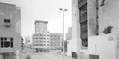
Simon Norfolk: Et in Arcadia Ego
On view through Feb. 18, 2006
Opening reception Jan. 13, 2006
Halsey Institute of Contemporary Art
Simons Center for the Arts
54 St. Philip St.
www.halsey.cofc.edu
Simon Norfolk’s photographs are awesome in the original sense of the word. Not, like, awesome in a “dude” way but awesome as in filled with his sense of it. They’re powerful, sometimes scary, and always impressive.
Take his work from Bleed, a book on the mass graves of Bosnia. Village populations were gunned down by the Serbs and buried in pits; in a post-war flurry of obfuscation, the bodies were bulldozed and re-interred in secret locations.
Norfolk took his camera to one of those locations — Crny Vrh — but he didn’t just document what he saw. He created abstract icescapes, including one with a disturbing red coloration. “That image is quite beautiful,” says co-curator Mark Sloan. “It’s powerful because it works on so many levels. It’s a haunting elegy to the hundreds if not thousands of bodies buried beneath the surface. It reflects the nature of what atrocity is and how it can be covered up by the land.”
Sloan co-curated Norfolk’s last Halsey show, Afghanistan: Palimpsest, held on the first anniversary of 9/11. Since then the artist has traveled the world, capturing the destructive effect of war on landscapes with a breathtaking tonal depth.
“My best efforts look like paintings,” says Norfolk, whose vistas connote landscape masters like Claude Lorraine, John Martin and JMW Turner. “They have a sense of texture and place. They’re nothing like pow-pow-pow news photography.”
Norfolk strives to give an opposite view of the received idea of what war zones should look like. “I wanted to get away from the tired motifs that we’re used to,” he says, “the refugee camp clichés of white gloves on little black baby’s bellies, or nose cone footage of a bomb flying through Osama Bin Laden’s front door. My work is anti-telly, anti-news photography. TV viewers have no real sense of what Afghanistan was, that it was a landscape in crisis. It was extraordinary how they had no idea what it was really like after watching hours of footage. I don’t have a TV at the moment, and it’s like unchaining yourself from a mad horse.”
The new Halsey show is a greatest hits collection of Norfolk’s work over the last four years, gathered during visits to Iraq, Bosnia, Normandy, Liberia, Israel, Palestine, and Africa.
“I look like a pillock with my bald head, Hawaiian shirt, and bizarre camera,” says Norfolk. “A harmless dickhead. If I wandered round with a TV camera or a small Nikon I’d be murdered or chased off. I’m amazed that these news photographers dress like soldiers — they’re just asking to be shot at by a sniper. Sometimes the best place to hide is in plain view.” His brazen attitude has helped him to generate images that seethe with personal frustration and compassion.
A shot taken at Hussain Khil, east of Kabul, Afghanistan, is dominated by a black plume of smoke from dark red brickworks. Sunlight gives the smoke its own brownish hue, and the landscape is a mix of volcanic towers and green crops. In another photograph, a colorful victory arch leads to a mountainous area with niches carved in the rock. The lonely arch is guarded by a single sentry who practically blends into the background, his head turned away from the camera.
The sentry could almost be one of the goat herders in Norfolk’s depiction of Agshar, looking down on the devastated Hazara neighborhood in western Kabul. Ruined rows of stone houses stretch into the background, while the herders echo the innocent subjects of Nicholas Poussin’s 17th Century painting, “Et in Arcadia Ego,” aka “The Arcadian Shepherds.” In this manner, the pastoral meets the pulverized.
While Norfolk’s 2002 exhibition at the Halsey juxtaposed his images with Afghani textiles, his new show has a distinct context of political science and social studies (co-curator Mark Long is an assistant professor of Political Science at College of Charleston).
“Norfolk has been working on this project for ten years,” says Mark Sloan. “During that time he’s been engaged in the idea of the effects of war on the landscape. That’s a layer that’s visible in his work, but there’s a subtext — what this is doing to us as humans. He’s a humanist, and I think his photos are a form of activism.”
Simon Norfolk presented a free artist’s lecture at Physicians Auditorium on Thurs., Feb. 16, 2006 at 7 p.m.
VISUAL ARTS Text Messages
by Nick Smith January 10, 2007
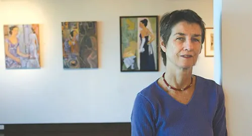
Carolina Umbra
On view through Sat. Jan. 21, 2007
City Gallery at Waterfront Park
34 Prioleau St., 958-6484
The best kind of retrospective art shows aren’t perfect at all. They’re fascinating because of their flaws, not despite them. They indicate periods in an artist’s life where new styles are tried, challenges are met and overcome, progress is made, in a carefully curated reflection of our own lives.
Recently, the City Gallery at Waterfront Park’s been hot on looking back. During Piccolo Spoleto 2006, William McCullough’s show (curated by his daughter, Currie) included early work — even a couple of childhood attempts — in his successful Southern Painter exhibition. The layout had a geographical element, showing how McCullough’s life in urban, rural, or mountainous regions affected his work. A few months later, artist Yaw Owusu Shangofemi’s blacksmithed sculptures dotted the gallery in Forging Spirits. The selection focused on the range of his work rather than a clear-cut chronology.
At present the gallery’s given over its entire space to the art of Mary Walker, who’s used literature to inspire some of her most accomplished work. Core inspiration for this show comes from S.C. Poet Laureate Marjory Wentworth’s new poem “Carolina Umbra.” Its simply structured, roiling lines capture the destructive power of Hugo, which leaves the poet marveling at its aftermath. In her poem, the hurricane leaves a hellish landscape of fire, smoke, sundered steel, and shattered windows left agape like a crowd of hungry mouths. It’s not a pretty image.
Walker manages to find the beauty within the chaos in her identically titled drawing and collage series. Behind stark shapes of black-crusted blood red, a hopeful glimmer of clear white can be seen. There will be calm after the storm.
Walker manages to pack these collages with a great sense of scale without losing a personal perspective. Her sense of place is carefully balanced with emotional expression. In contrast, the simpler drawing, print, and collage pieces in the show look like much earlier experiments, with rough-edged, clumsier shapes that suggest a folk art sensibility. But no, her “Sugarlift Birds” and “The Marjorys” series were created in 2006, just like “Carolina Umbra.” The latter series is strong enough to make an impression in its own right without its smaller, less accomplished companions.
While the sense of linear progression isn’t always obvious, Walker isn’t afraid to display her imperfections. She tries different media, develops series over months or years, fueled all the while by her love of literature. She directly refers to Wentworth, as well as more esteemed sources: the Bible, Dante, Shakespeare; there’s a paperback copy of Dante’s Inferno right next to her ink and woodcut interpretations of the cantica. It’s easy to imagine her getting excited about the text and rushing over to transfer her passion onto canvas.
Although Walker doesn’t see her show as a retrospective — she describes it merely as “work I haven’t shown before” — there are examples of art from earlier decades: naïve oils from the ’80s, chunky linocuts from the ’90s, plus three decades-spanning “Carolina Gold” pieces, pencil-and-watercolor works in progress that suggest a community built on the blood and bones of less fortunate predecessors. In “Carolina Gold Blue,” for example, scenes of rural life mingle with large pencil corpses.
Walker’s dark visions explain why she was drawn to Wentworth’s poem, and her choice of subject helped make her a likely candidate for last year’s $5,000 Donna and Mike Griffith Lowcountry Artist’s Fund Award, administered by the Coastal Community Foundation of South Carolina. The Griffiths annually sponsor a local artist to create new work that reflects life in the Lowcountry. Last winter, Walker submitted a written proposal and six slides of her art, but wasn’t sure whether she’d follow through on the project. “I’m not a landscaper,” she says. “I almost didn’t do it.” Before she even knew if she’d won the award, she started on her project to prove to herself that she was really committed to seeing it through.
The completed show, curated by past gallery coordinator Catherine Heitz New, is intermittently dark, optimistic, intriguing, and a little rough around the edges — much like the Lowcountry it does its best to evoke.
Local artists shouldn’t have to struggle to make a living
by Nick Smith December 29, 2010
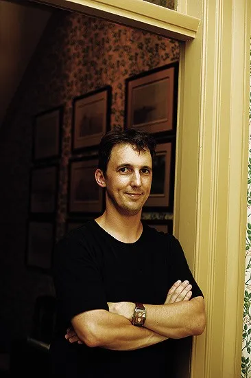
You don’t have to be an art lover to recognize we’ve got hot creative talent in this town. Our festivals alone show that we can deliver the goods on a professional, culturally edifying level. So why don’t our artists, performers, and producers get the support they deserve?
With each passing year, state funding seems to shrink, leaving artmakers to chase private donations and ticket sales. According to the National Assembly of State Arts Agencies, the projected arts legislative appropriations from the state of South Carolina next year are $2,290,382 — more than 25 percent less than 2010’s actual appropriations. That short-changes an important local employer: the artistic sector.
So far, more than $6 million has been handed out to train Boeing workers, a force that will be 3,800 strong. Compare that number to the findings of a 2010 research study funded by Charleston’s Creative Parliament, New Carolina, and the Charleston Regional Development Alliance: 27,315 workers were employed in creative endeavors in 2008. Less state funding means fewer art projects and fewer opportunities for locals unless, like too many Charleston artists, they’re prepared to work for free — something that no assembly plant worker in their right mind would be willing to do.
Somehow, artists find the will and passion to do just that, enriching the state with their creations. But they have to compromise. Over the past few years, I’ve seen painters make beautiful art that they have to store in the steamy outdoors because they can’t afford studio space, performers singing their hearts out for free, producers making shows on shoestring budgets, and theater companies (like Art Forms and Theatre Concepts) without a stage to call their own.
Among these artists, there’s a sense of camaraderie that encourages them to keep coming back. But economic reality doesn’t always allow that to happen. Dozens of fine actors, artists, and musicians have left town because they don’t get paid enough to live here or they just can’t afford the rent. A prime example: eminent sculptor Tom Durham, who told me point blank that he was leaving Charleston because the rent was too high for him here.
Lack of funding has forced artists to be extra resourceful, and if necessity is the mother of invention, then these kids must be the MacGyvers of the South. They make do with limited materials, use alternate marketing methods, and are very appreciative when they do get a hand out. The lack of excess cash also tempers any self-indulgent urges they may have, but they have bills to pay just like anyone else.
While the Charleston Symphony Orchestra is back in action, it still lacks aid from the state and corporate sector. “Unfortunately, in this economic climate many performing arts organizations are struggling financially,” CSO President Ted Legasey said in March. “We have seen a strongly negative effect on revenue as major contributions have decreased by more than 60 percent over last year.”
We need to give cruise ship visitors an alternative to picking through overpriced Market Street knickknacks. Art is part of Charleston’s alluring aesthetic, complementing the architecture and giving visitors a big reason to return. It’s about time the importance of local artists was recognized and suitably rewarded so that tourists and locals can benefit from their work for a long time to come.
VISUAL ARTS Framing the Year
by Nick Smith December 27, 2006
Keeping tabs on all the high-quality visual art that crops up around town can be tough on a guy, especially on a weekly schedule. There are well over 100 commercial galleries in town, two city galleries, and an array of alternative spaces; in recent months, shows have been held in a record store (52.5), pubs and restaurants (the Village Tavern, Vickery’s, Med Deli), and a hotel (the Market Pavilion).
As if that weren’t enough, some new contemporary galleries have opened this year: Danny McSweeney’s Spark Studios and Kristy Cifuentes’ Avondale-based Modernisme have both survived long enough to build up strong followings and a roster of talented progressive artists.
There’s also lots of worthy work beyond Charleston, including the outdoor sculpture exhibitions in North Chuck’s Riverfront Park and a good mix of public and fine art projects at 10 Storehouse Row. The Sumter County Gallery of Art has been hosting some increasingly strong shows that are begging for a mention. Right now Arturo Lindsay’s solo show Healing is up there, gracing the gallery’s walls with large-scale contemporary mixed-media pieces that reflect the African diaspora. The Columbia Museum of Art is proudly displaying Picasso’s Head of Man painting and is hosting a traveling Frank Lloyd Wright show dedicated to his graphic and decorative designs.
In other words, there’s a lot of good stuff to see out there — more than we can hope to squeeze into the CP. But we do try to cover all the major art happenings in Chucktown, and warn you about the stinkers, as well. This year has seen more than its fair share of those.
2006 started well with two rich, enthralling shows. The Halsey Institute of Contemporary Art exhibited powerful, politically resonant photographs by Simon Norfolk, while the Gibbes Museum of Art tapped into local fondness for another photographer, Walker Evans, with the traveling Three Weeks in Cuba exhibition. The black and white images that Evans captured while visiting Cuba with Ernest Hemingway were enhanced by some of the writer’s personal ephemera, screenings of A Farewell to Arms, and one or two interactive elements. The show was even more impressive considering that the Gibbes had no executive director at the time (Betsy Fleming had departed the previous September), and her eventual replacement Todd Smith recognized the museum’s savvy staff by keeping them on and giving them clearly defined positions.
The quality of these shows set a high standard for rest of ’06. Disappointingly, that standard wasn’t always met. Redux Contemporary Art Center, also without a director at the top of the year, took a while to present a memorable show. Perhaps the sheer number of events it tried to organize — live music, documentary screenings, and 12 shows in as many months — meant that quantity would outweigh the quality.
Re:Invention, an attempt in January to get back to its roots with art by the Center’s studio renters, was coherent but tame. Another low-key offering, NATURE:Redrawn, also lacked any serious impact. Renee Van der Stalt, Talia Greene, and Christine Buckton Tillman did clever things with paper but failed to capture the true thrall and intricacy of their natural inspirations. With Seth Curcio now officially at the helm, Redux is picking up steam, offering more effective shows like the hand-printed Hot Pressed Poster Fest.
We can’t say the same for the City Gallery at the Dock Street Theatre, which has suffered from its limited wall space and a mostly uninspiring choice of art. We haven’t heard anything from Calvin Dilligard’s Culture Shock Movement since its overhyped, immaturely wrought Fusion of the Arts back in March. We also believed the billboard-heightened hype for the Gibbes’ Edward Hopper in Charleston, but there was only so much the museum could do with 12 watercolors. With a little more space and more emphasis on the important work of his wife, Josephine Nivison Hopper, this could have been the “landmark show” the Gibbes’ ad campaign promised.
The Halsey Institute hasn’t always come up trumps. Gallery space was devoted to some mostly unimaginative CofC student work in April’s annual Young Contemporaries. We were left with the impression that Director and Senior Curator Mark Sloan was so busy organizing the spectacular multigallery, multi-artist Force of Nature and preparing for a 2008 relocation that the Halsey was left to coast a little, but that’s only because of the high benchmark he’s set for the gallery in past years.
It’s been the privately owned local galleries that have put together some of the year’s most memorable shows. Currie McCullough risked 53 Cannon’s fine-art reputation on contemporary paintings (a Kevin Taylor retrospective), photography (Through a Glass Darkly), and even vinyl (May’s Munny Show). Nina Liu presented work by many of her favorite artists from her gallery’s 20-year existence; currently she’s featuring the paper lightshades of Smithsonian-bound Jocelyn Châteauvert, who tastefully blurs the line between art and functionality. And Sherry Browne’s Studio Open is always worth the trek to Folly Beach. Sonoko Mitsui’s installation there had as much aesthetic impact as any of the Force of Nature components, covering a similar theme of the artist’s personal relationship with the environment.
With their directors finally in place, Charleston’s art institutions can learn a lot from the hard-working, underappreciated gallery owners who have kept things ticking between major happenings.
VISUAL ARTS The Year in Visual Arts
by Nick Smith December 28, 2005
In a year when our readers voted the Market as the best place to buy art and the Gaillard still gets confused with the Gibbes, it’s worth taking a look back at Charleston’s array of exhibitions this year, which, despite it all, were remarkably diverse. If art is influenced by the context it’s viewed in, then the sheer number of different spaces used — from houses and hotels to gutted stores and offices — indicate local artists’ willingness to stretch their abilities and trust that art buyers won’t be too snotty about where they find their wares. It’s like asking a dog lover to buy a puppy in a back alley; if the pooch is good-looking enough, it’ll get plenty of attention.
Not all of 2005’s shows were city-bound. The number of galleries has grown to meet the increasing demand of newcomers and visitors to the area. The Gallery at Freshfields, in a brand-new village at the entrance to Seabrook and Kiawah Islands, is a good example of this. Owned by Robert Hicklin Jr., it specifically targets vacationers and opened before Freshfields Village was fully occupied. With a mix of representational oils, sculptures and photography and a high-tech viewing room, it represents a leap of faith for Hicklin as well as a chance to test ideas that might not fly in his more traditional Charleston Renaissance Gallery.
Similar risk-taking has led to the successful launch of new galleries in the city as well as some notable one-offs. At 53 Cannon Street Gallery, the McCullough family transformed a cozy house into a site for some innovative shows, including Women Having Fun (a benefit for the Center for Women) and their current All Seasons of South Carolina Landscape Painting. Featuring meticulous work from William McCullough and several other locals, the organizers have a habit of giving hackneyed themes (nudes, still lifes) a fresh twist. It doesn’t hurt to find the work displayed in innocuous settings that include the kitchen and bathroom.
Capitalizing on the continuing resurgence of Upper King, some unlikely spaces became outlets for talented artists like Seth Gadsden and Krist Mills, who ran The Floating, a wide-ranging multimedia show, in parallel with last spring’s Spoleto Festival. Their 5,000-square-foot space proved too small to hold their many artists’ ideas, with mounds of carpet bleeding into a back lot for a tree-sized installation by Shelby Davis.
Pieces of Sanity and Curious Tales were equally ambitious multimedia shows at the Humanities Center on Rutledge Avenue. Sanity had enough strong elements to carry its weak video art, while Tales combined original new music, poetry, visual art, film, and interactive installations, including a room with 3-D projections courtesy of Tripp Storm.
The influence of our institutional galleries was proved by an exhibition at the Gibbes. Henri Matisse’s work got plenty of international attention through retrospectives at the Royal Academy of Arts in London and the Metropolitan Museum of Art in New York, coinciding with a continued interest in abstract art. This was reflected locally by Beyond Representation: Abstract Art in the South, a wide-ranging show with pieces by Matisse, Joan Miro, and Roy Lichtenstein alongside familiar local names.
“During Spoleto there were a lot of shows that highlighted abstract work,” says Brian Rutenberg, a College of Charleston grad now painting and exhibiting successfully in New York, “including the terrific exhibition at the Gibbes and one at the Ella Richardson Gallery on Broad Street. The response was very positive.”
Beyond Representation led viewers to Eva Carter’s non-representational gallery, and there was a distinct sense of crossover as she opened an abstract show last month, highlighting work by Carter, Michael Tyzack, and William Halsey, all of whom had work in the Gibbes exhibition.
Rutenberg also nipped down from New York to curate Cooperation of Pleasures, the Halsey’s intriguing contribution to the abstract milieu. While Julie Evans drew her inspiration from Indian miniatures with tiny, detailed gouache and acrylics on paper, Barbara Takenaga went large and cosmic with her hypnotic space scenes.
Sporting a new name, the Halsey Institute of Contemporary Art stated its intention to be an “adventurous and innovative venue.” Its crowning achievement this year has to be its collaboration with Redux Contemporary Art Center, Magar Hatworks, RTW, and the Music Farm during Spoleto for the Alive Inside sideshow spectacular, allowing each space to keep its own identity while retaining the strong theme of freaks as art objects. Ironically, the work involved in running the show put extra pressure on Kevin Hanley, who became Redux’s first executive director in March and quit the role before the dust had settled on Sawaguzo!, the first event he personally instigated. The gallery has yet to announce a replacement.
2005 provided opportunities to sample all the major media, with unique installations at the Halsey (ElseWHERE), Shimon Attie’s emotionally charged photography at the City Gallery at Waterfront Park for Piccolo, actor Billy Dee Williams’ airbrushed acrylic figures at the Richard James Galleries, and sound art at CofC’s Addlestone Library (an Arnold Schoenberg retrospective). While Charleston may not be known for innovation — tourist-targeting landscapes and figurative artworks continue to outweigh their contemporary cousins here — it’s clear local artists haven’t lost their inventive attitudes toward creating and showing their more progressive stuff.
Alison Piepmeier’s unique new book studies a text riot
by Nick Smith December 23, 2009
College of Charleston Assistant Professor Alison Piepmeier’s students are under pressure. They’re assailed on all sides by print media packed with images of perfectly formed, unblemished models with the power to make them feel unattractive or underrepresented. Piepmeier, who directs the Women and Gender Studies Program, has seen the serious effect this pressure can have on some of her undergrads.
“They’re facing some really serious body issues,” she says. “The college is recognized as having beautiful women. They feel there’s a certain way they need to look. That affects their quality of life in debilitating ways.”
But what if there were alternatives to those glossy perfect-world periodicals? What if women could create their own publications that reflected their own individual points of view? Piepmeier learned that a surprising number of females have fought back with zines, homemade magazines covering topics that are relevant to them and giving their lives a powerful punk twist.
Bringing these zines into her classroom, Piepmeier recognized their continuing popularity even in a time of blogs and social networking. When a New York University Press editor asked her if anyone had written a book on the subject, she found that nobody had. Her new book Girl Zines: Making Media, Doing Feminism unearths the phenomenon, analyzing titles like Fragments of Friendship, Grit & Glitter, and I’m So Fucking Beautiful.
Although the current crop of photocopied or self-printed zines have their direct roots in the Riot Grrrl music scene of the early ’90s (Piepmeier often refers to them as grrrl zines), she traces their ancestry through the scrapbooks of the 19th century, mimeographed pamphlets in the ’70s, and the ornate handmade packaging that some zines have been shipped in over the years to give her academic subject extra validity. “I too had fallen into the mindset that these weren’t important enough to study on their own,” she says. By placing them in a greater historical context she was able to take them seriously in their own right. “Many zines I read are incredibly thoughtful and complex,” she adds. “They’re documents of feminist and female legacy.”
And what a legacy. These are reflections of life seen through an uncompromising prism of gender politics, a text riot of reportage, personal observations, stream-of-consciousness rants, pocket-sized poems, and collages, all presented in a do-it-your-damn-self anti-mainstream manner. East Village Inky is crammed with Ayun Halliday’s tales of life as a parent of young children. Jigsaw‘s manifesto calls for girls to assert their own identities. Figure 8, Shameless, and (our favorite title) Fat!So? are an antidote to our stick-thin-is-beautiful social mores. But the majority of zines are each a mixture of different writing/art styles, subjects, and approaches in a black-and-white package.
Local LGBT campaigner Jenna Lyles prefers to publish one-off zines rather than numbered series. Her latest is Queer(ing) Activism, reporting on a queer flash mob on the CofC campus right before the Thanksgiving break. Hailing from Greenville, S.C., Lyles first encountered a zine in her freshman year when Piepmeier assigned one for her to read. Three years later she’s a zine veteran, distributing her work by hand or word of mouth.
“People my age and activists feel disempowered, as if we can’t affect what’s going on,” says Lyles, “When you give someone a zine, they have something in their hand, and they’re not so removed from the issue. It makes me feel like I can do something.”
Lyles’ zine is just one of the 20 or so Piepmeier has been given in Charleston alone.
Although the zine heyday is in the past thanks to the internet, these DIY magazines will always have a place in participatory culture. According to Lyles, a zine has to be something you can physically hold. She says, “Digitizing it takes a lot of its power away.”
Piepmeier has heard similar reasoning from other zinemakers, recounting something she had previously heard. “A zine could be shoved in a box and 100 years from now it could be found in an attic,” she says. “It has a longevity that blogs may not have.”
While it’s really intended for scholars, Piepmeier hopes that her book will introduce casual readers to zines as well. The book is short and readable enough for non-academics to follow, and the sheer number and scope of the zines she covers just might encourage readers to start their own.
What do the years ahead hold for the arts?
by Nick Smith December 23, 2009
The future is finally here, if you believe everything you see on the internet.
Face recognition software can scan your photos and pick out individual features. You can build your own Back to the Future-style hoverboard for around $500. Space tourism is finally a reality. Jetpacks and flying cars are pricey (available for six figures), but they exist.
Closer to home, our tourists go to Ft. Sumter, not the firmament. The only face recognition we have is when we spot a buddy as we pass them on King Street. And we’re still just a ways from getting a regular skatepark built downtown, let alone a hover-friendly one. But we still have dreams and ambitions.
This fall we asked some local creative types for their visions of the future. What did they think life would be like in the new decade, or 1,000 years from now?
Most of the answers were soberly focused on each interviewee’s field of expertise. Redux Executive Director Karen Ann Myers described herself as “naively optimistic” about the years ahead. “The definition of how art prices are determined is going to change,” she told me. “People’s perceptions of art and its value will be different.” More fancifully, she wanted to see everyone in a buoyant mood. “I imagine the Earth being a giant trampoline with everybody bouncing everywhere. There would be no cars, traveling would become difficult, but just walking around would be really fun.”
Charleston Center for Photography Owner/Director Stacy Pearsall was more down-to-earth. “The bleeding heart in me wants to see no poverty,” she sighed. “If that answer’s too Miss America for you, I’d also like to see education in art. It would be great to see people being encouraged to be creative. That would be right up there with flying cars.”
Outspoken classical musician Robbi Kenney’s dream is to start a for-profit orchestra in the future. “I could stick around waiting for the right nonprofit structure to develop,” she says, “but I want to do something in my lifetime.” Kenney also wants to see the arts integrated into the for-profit world. She says this would revitalize local organizations, leaving performers free to create. “Artists need to try harder to connect with the audience. Anything that drives the human spirit will attract people.”
So what does the future hold for us? Recently, we’ve seen a consolidation of production and marketing among art groups. Theatre Charleston is an organization set up by several theater groups to jointly promote their shows. Over its four-year existence, its roster has grown from five to nine groups. Charleston Premier Arts is a similar initiative touting the Christmas shows of Charleston Stage, Charleston Ballet Theatre, and the Charleston Symphony Orchestra. The Charleston Arts Coalition is helping artists and businesses to connect with seminars and market research.
Instead of chewing off each others’ hind legs for a diminishing piece of sales, artists have joined forces. There seem to be more collaborative shows than ever; most recently Robert Lange and Nathan Durfee at Robert Lange Studios and Laura Gaffke and Tina Hirsig at Plum Elements have combined their talents to create fresh work. There’s no reason why a healthier economy should change that, although some unions will stand the test of time while others drift by the wayside.
But another, less healthy trend is a steady departure of young talent from Charleston, especially in the acting community. In the past year I’ve seen some of the city’s best actors and comedians move to New York, LA, or Chicago because they weren’t getting the support they needed here — or were too busy scrambling to pay their bills to fully utilize their artistic gifts. They and their peers in various disciplines are the future of local arts, and without nurturing such talent, we’ll be stuck in the dark ages for a long time to come.
VISUAL ARTS Flower Power
by Nick Smith December 21, 2005
Wild Things & Wonder
On view through Jan. 29, 2006
Free
City Gallery at Waterfront Park, 34 Prioleau St.
Visceral
On view through Jan. 2, 2006
FreeCity Gallery at the Dock Street Theatre, 133 Church St.
Honor Marks may use titles like “Carolina Lily” and “Smooth Coneflower,”‘ but her intricate nature studies aren’t the kind of florals found on Granny’s wallpaper or Aunt Jemima’s summer frocks. Marks seeks something special among the seedlings, finding beauty in the lowliest rock, shrub, or roach.
Venus flytraps emit a lively yellow glow, inviting fireflies in for dinner. Delicate, pale brown loggerhead turtle eggs huddle together in a sandy hollow. A relict trillium with carefully defined shadows on its petals is painted with a care that borders on the clinical, but it still looks fancy. Even a giant palmetto bug looks harmless, eschewing its more revolting qualities. It could almost be another seed or plant — only its fire-flecked colors reflect its creepy crawly capacities.
Marks gives us extreme close-ups of her subjects, finding God in the greenery. An intersected “Crucifix Tomato” shows a perfect medieval cross. A phalaenopsis orchid reveals an ornate figure with wings and tendrils; while UFO abductees would recognize it as an alien, those of a spiritual persuasion will see an angel.
As the recipient of the Coastal Community Foundation’s 2005 Donna and Mike Griffith Lowcountry Artist Award earlier this year, Marks joins runner-up Daryl MacInnes in an invitational exhibit, Wild Things & Wonder, at the City Gallery at Waterfront Park. With her work in the show, Marks has focused on endangered species such as the beach morning glory, accompanying it with literary quotes and info bites.
It’s definitely worth taking the elevator, not the stairs, to the gallery’s second floor. When the door opens, a surprising image greets visitors, one that’s very different from the parade of petals below. Daryl MacInnes’ “Place to Start” shows a lantern-bearing skeleton wandering a forest, bones scattered at its feet. The woodland world exists in the orb of a larger skull, and the fleshless trekker introduces a motif that crops up in other examples of the artist’s work.
“Place to Start” was MacInnes’ first painting, completed back in 2001. This show provides a chance to follow his progress as he develops his chosen themes, with anthropomorphized trees a common sight. In “No Rush,” a tree has skeletal aspects including a ribbed trunk. It stands in a crucified pose and a human skeleton lies in front of it, flanked by two gravestones engraved with yogic words: “Abhyasa” (practice) and “Vairagya” (dispassion).
All this may sound a bit over the top, but MacInnes’ work is deft and it’s fun to see him looking for new ways to tackle hoary old plein air subjects. “Field” is more than a traditional landscape, because it’s painted from an interesting perspective, with the yellow-brown field taking up the lower half of the canvas. The artist also has a good grasp of classical techniques; in “Dawn at McLeod,” he uses light, striking colors for Spanish moss, slave cabins, and patches of sun to lead the eye around the picture.
Juxtaposed with the oaks and cadavers are more examples of Marks’ art. Her work evokes a sense that this is a lab, not a jungle, with artifice and technical experimentation taking precedence over natural chaos. Everything’s too neat to be truly wild.
Michael Gibson’s sculpture, “Entangled,” is the most accomplished artwork in his Visceral show at the Dock Street Theatre. The gravity-defying piece has plenty of mysterious interstices, dents and curves to catch the light. It resembles several real-life forms, including a baby in a cradle, a shattered sea shell, an inner ear (mirroring a shape in one of his colored charcoal “Nightscape”) or the jawbone model one sees at the dentist’s.
The different works in Visceral could almost be by different artists, such is the variety of ideas on display. There’s no harm in using a small exhibition like this as a chance to show examples of an artist’s versatility, and Gibson’s resourceful flair is summed up in the vibrant “Lost Tribes.” It features a ghoulish face with cottonmouth stitches on its lips, a drowsy, sad expression, and drooping eye sockets. Daryl MacInnes would approve.
